10.05.2023 - 11-.09.2023 / Week 1 - Week 7
Sheryne Axellia Putri / 0367267 / Bachelor of Design (Honours) in Creative Media
Digital Photography & Imaging
Project 1
TABLE OF CONTENTS
-Submissions:
PART 1A: Physical Collage
WEEK 1 05.10.2023
- Pinterest Board (DPI): https://pin.it/GJgLK3F
- List down your 3 favorite graphic design works from Pinterest, and explain why you like the designs.
Description: This picture is from an album named “Treasure” by an alternative rock band called Cocteau Twins that formed in 1979.
The Poster expressed: The cover features a large, abstract shape supported with patterns, and the image is in a pale blue and beige color scheme, giving it a sense of depth and dimension. The band has a distinctive aspect of its music that is atmospheric and dreamy, so the design perfectly represents the album’s visual work.Description: An alternative movie poster for the film “The Godfather.” It takes place in New York and is about a mafia family.
The Poster expressed: that the mafia as we know wears a suit or luxurious clothing so the cover only focused on the suit is very creative because we know from the first look what we’re going into. The simplicity yet elegance of this poster represents the wealthy life of the mafia family. Then the addition of a yellow grainy texture on the white shirt makes it even more unnerving.
Design #3:
Description: Another alternative movie poster, this time is a horror movie called “Suspiria”.
The Poster expressed: Usually a horror movie poster would show a full reveal of the monster/antagonist or even a glimpse of it, the concept for this one is rather beautiful than scary, yes it is still uncomfortable to look at which makes the viewer even more captivated. The strings that came out from her fingers represented the mysteries that hold. The more you look at it the more little details are uncovered.
WEEK 2 10.12.2023
INSTRUCTION:
1. Choose and identify your collage's design elements to be cut out and compose it into your own concept & story.
2. Pre-compositing your collage's design elements into a composition.
3. Take 3 photos of your collage pre-composition and insert them in the section below. Please use the camscanner app to take pictures of your collages.
1. Composition #1
Figure 1.9 Week 2 (10/12/2023) Composition #1.
2. Composition #2
Figure 1.10 Week 2 (10/12/2023) Composition #2.
3. Composition #3
Figure 1.11 Week 2 (10/12/2023) Composition #3.
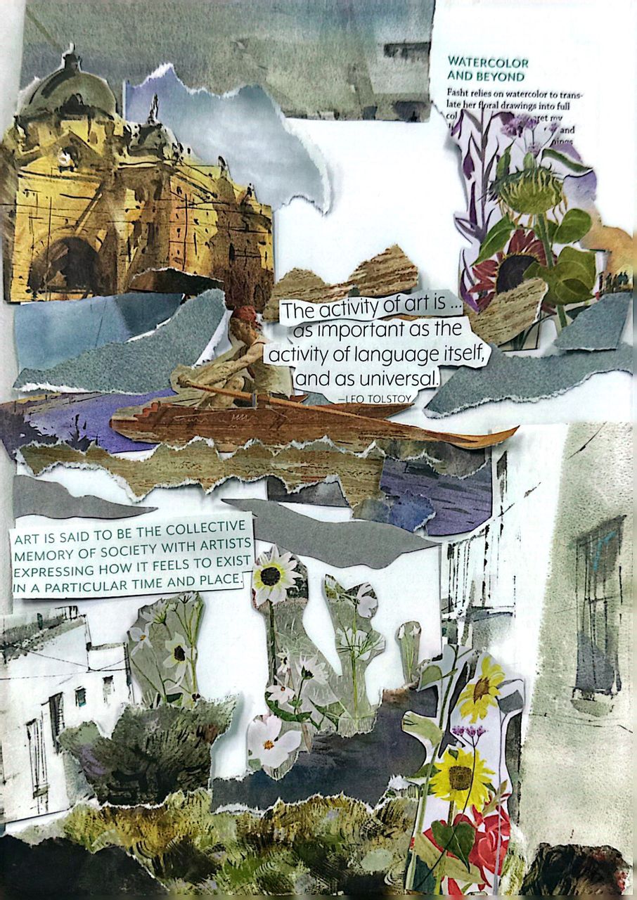
SUBMISSION: Physical Collage
Figure 1.12 Week 2 (10/12/2023) Composition #3.
WEEK 3 10.26.2023 - Introduction to Photoshop 2
INSTRUCTION:
1. Download all of the images that are provided to your computer.
2. Follow the tutorial demo as a reference to create your digital collage.
3. Create 3 different composition digital collages from the images that you’ve downloaded.
4. Create an A4 canvas size (vertical) in Photoshop and start to do the compositions.
5. Take 3 photos of your digital collage compositions and insert them in the section below.
1. Composition #1
Figure 1.13 Week 3 (10/19/2023) Composition #1.
2. Composition #2
Figure 1.14 Week 3 (10/19/2023) Composition #2.
3. Composition #3
Figure 1.15 Week 3 (10/19/2023) Composition #3.
WEEK 4 10.26.2023 - Adjustment Layers and Filters
INSTRUCTION:
Attach your best composition from the WEEK 3 digital collage exercise below.
Using the same Photoshop file, improvise your WEEK 3 digital collage into WEEK 4 by using Adjustment Layers & Filters on Photoshop.
Explain what you’ve learned in the description section.
SUBMISSION: Digital Collage
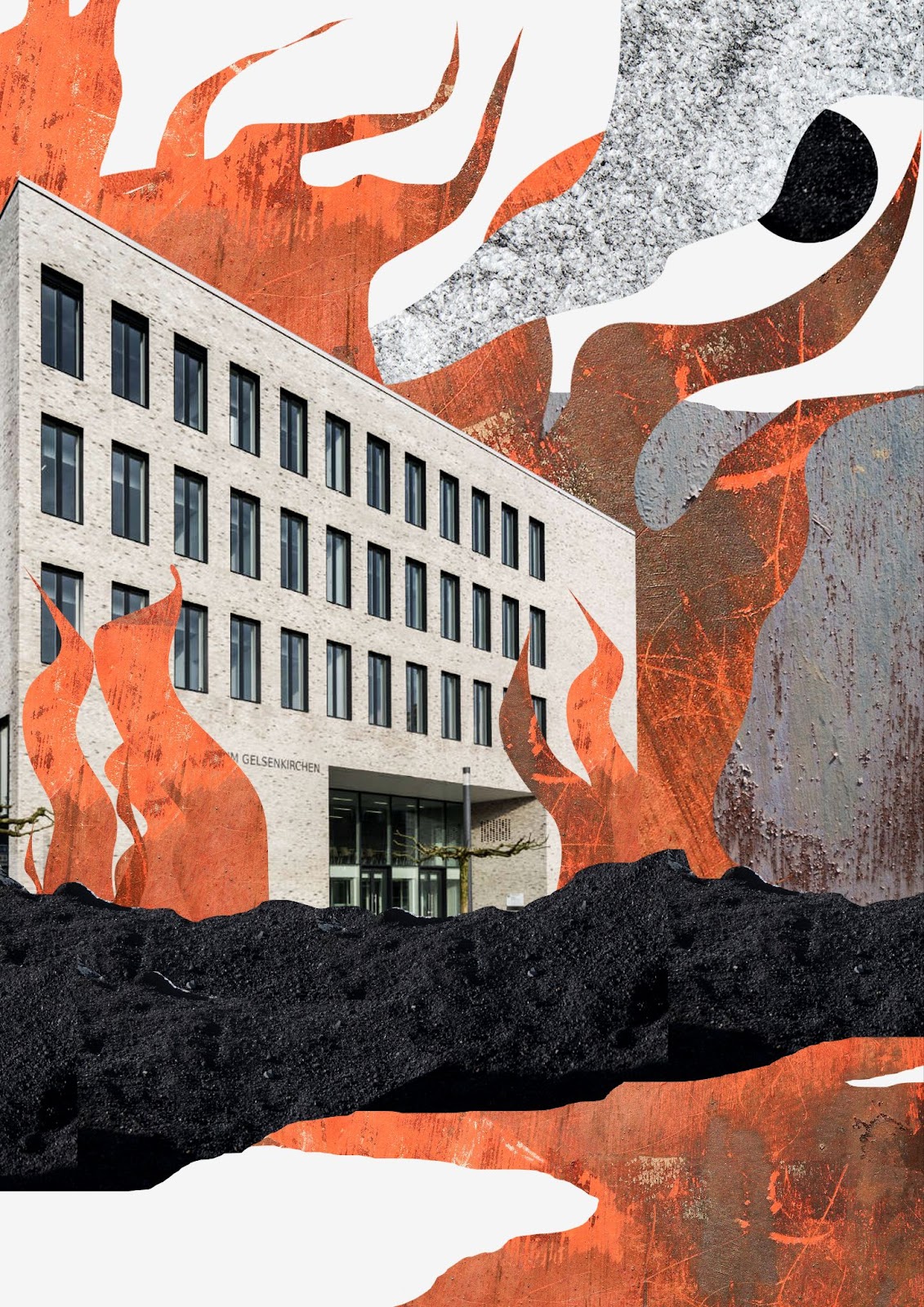 |
Figure 1.16 Week 3 (10/19/2023) Composition #1 + adjustment.
|
Description: I changed the size and dragged some of the objects to make it more composed, like the placement for the fire and the smoke, I also added a little contrast to show the texture of the fire.
PART 1B: Digital Imaging Exercises
WEEK 5 11.02.2023 - Digital photography
Digital Imaging Exercise 01 - Shazam.
| Figure 1.17 Week 5 (11/02/2023) Hearst mansion #1 Shazam. |
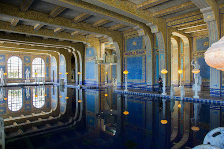
Digital Imaging Exercise 02 - My reflection.
Instruction: Use your own photo to be inserted into 'my reflection' (your photo version) composition.
Figure 1.18 Week 5 (11/02/2023) Hearst mansion #2 my reflection.
|
Project 2: Digital Imaging Exercise 02 - PART 1
Objective:
Turn the B&W photo into a COLOUR photo
 |
| Figure 1.19 Week 6 (11/09/2023) The finished result #1. |
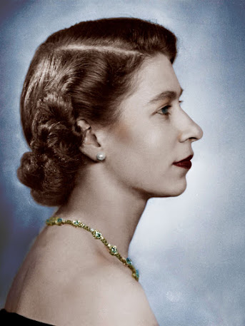
Project 2: Digital Imaging Exercise 02 - PART 2AObjective:
Turn the B&W photo into a COLOUR photo - advanced level.
 |
| Figure 1.20 Week 6 (11/09/2023) The finished result #2. |
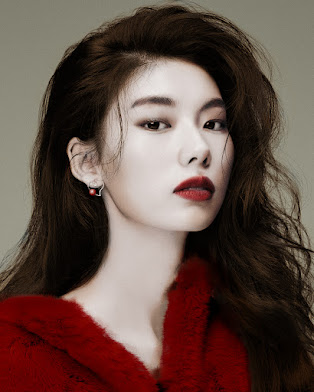
Task 2: Digital Imaging Exercise 02 - PART 2B
Objective:
1. Select ONE B&W photo from the folder:
2. Search photos online for skin/hair references. Recolor the photo for submission.
 |
| Figure 1.21 Week 6 (11/09/2023) The finished result #3. |
W1: I find it interesting that our first activity to get to know about the module is to present what kind of graphic design artwork, for me, it shows what kind of artwork we're trying to pursue and what kind of different styles inspire us. Also, it inspires me to make designs that could move people like how I feel with the
W2: Before making the finished result of the collages, it is important to adjust the pieces of the magazine in different directions or places. Because you get ideas that you didn't even think about before.
Here are my attempts before the final result:
Figure 2.1 & 2.2 Week 2 (10/12/2023) Composition attempts #1 & #2.
My first idea is Fig 1.12 but I feel it's too out of place and crowded so I tried to make an attempt to try again, alas I came up with Fig 1.13 but it still looks wrong, if I hadn't done any of these trial adjustment my final result would be Fig 1.12, so I'm glad I did it in the first place.
W3: For a digital collage, I find it more fitting for it to be clean and structured rather than a physical collage. Physical collage can be abstract and messy yet still charms in its own way. I struggled to think about the composition in digital collage than the physical collage.
W5: The ability to mask a subject, adjust hues, and play with contrast has given me to selectively disclose or conceal elements within an image.
W6: When adding color to a black-and-white photo in Photoshop, the goal is to enhance the visual impact of the image while maintaining a balanced and harmonious appearance. I chose a limited and purposeful color palette. Too many colors can distract from the essence of the photo. Select colors that complement the mood or theme of the image.
W7: Try to experiment with different images, blend modes, and compositions. Photoshop provides various tools and options, so take the time to explore and study to achieve the desired result. And ensure that the resolution and image quality of the source images are suitable for the final output. Maintaining high-quality images helps avoid pixelation or loss of detail in the double exposure.
W9: Before diving into the editing process, ensure a thorough understanding of the conceptual vision behind the product photoshoot. In this case, Mr. Fauzi tasked us to make at least 3 sketches and then showed them to him for feedback, this helped guide my editing decisions and align the final images with the intended message.
W10: As Mr. Fauzi said it is important to keep your project organized by using folders and labels to arrange assets. This makes it easier to manage multiple layers, compositions, and effects. I regularly preview the composition to check for smooth motion, visual consistency, and any issues that may arise during playback.
Observation
W1: After explaining what each graphic artwork represents I have seen and realized what the poster really represented that I didn't know before.
W2: Choosing the objects from the magazines is quite hard since the magazine is already the perfect source for a print publication that contains a variety of articles, photographs, and illustrations. Our task is to make a collage that combines a variety of different materials to create a unique work of design.
W3: Digital collage doesn't require more time and effort to edit, it can be edited and resized as desired, making the process much faster and efficient. Physical collages are made of real materials while digital collages are made using digital file formats and software.
W5: Adjusting colors in Photoshop is a crucial aspect of the editing process because it allows us to enhance and refine the visual impact of an image. Color adjustments can significantly influence the mood, tone, and overall aesthetics of a photo.
W6: I find it easier to fill the color by learning the color temperature of the light in the original photo. Adjust the colors you add to match the warmth or coolness of the existing black and white tones, ensuring a balance. Also, pay attention to the contrast between the color and grayscale areas. Adjust the contrast of the added colors to avoid overshadowing the details present in the black-and-white portions of the image.
W7: Adjust the contrast and brightness of each image before combining them. This helps me to create a more balanced and visually appealing double exposure effect. Adjusting the opacity of each layer to control the intensity of the double exposure effect to find the right balance ensures that both images contribute to the overall composition.
W9: Consider adjusting or enhancing the background to complement the product's concept. This could involve creating a clean and minimalist background or adding elements that enhance the narrative.
W10: Ensure a smooth flow throughout the composition. Consider how elements transition from one to another, and use techniques like easing and proper timing to maintain a cohesive rhythm.
Findings
W1: In all the artworks I've noticed that there seem to be metaphoric or symbolic elements of what it is trying to express. Each design has a different theme and story so it is important to know what you're working on for a poster and do some research before designing the poster.
W2: Collages can be an effective way to express creativity, views, and experiences. The process of making a physical collage involves cutting or tearing materials in different shapes and sizes. It can also be a way to experiment with different techniques and styles.
W3: Texture can be an important element in digital collage, it adds depth and dimension to the composition. Using texture is a way to add an extra layer of dynamic and visual interest to a digital collage.
W5: Adding shadows in editing is important for several reasons, contributing significantly to the realism, depth, and overall visual appeal of an image. Matching the lighting conditions and shadows ensures that the composited objects appear natural within the shared environment.
W6: I like to use the opacity setting and blend modes to control the intensity of the added color. Experiment with different blend modes such as "Color," "Soft Light," or "Overlay" to achieve the desired effect. Adjusting opacity allows us to find the right balance between the color and the original black-and-white tones.
W2 Specific Feedback, Every composition for collages must have a main headline to tell what is the purpose or theme of the collage itself, you can add small texts or paragraphs but make sure to have a main headline.
W2 General Feedback, before you start creating a collage, it's important to have a clear theme or idea in mind, this will help ensure that all of the elements in the collage work together as a whole. Composition is very important, make sure every element of the collage supports each other.
W4 Specific feedback, Mr Fauzi said it's better not to change a lot with the color adjustment/filter (vibrance and contrast) for my final submission. Because for my final artwork, it is best as it is I changed the size and dragged some of the objects to make it more composed, like the placement for the fire and the smoke, I also added a little contrast to show the texture of the fire.


Comments
Post a Comment