Focal Point, helps the viewer's eyes naturally settle on the important pieces of your design first.
Figure 1.1 Week 2 (10/12/2023) Focal point.
Scale & hierarchy, scale is often used to help communicate hierarchy by drawing attention toward and away from certain elements, thus signifying their importance to the communication.
Figure 1.2 Week 2 (10/12/2023) Scale & hierarchy.
Balance the elements → think of each element as having a 'weight' to it.
Figure 1.3 Week 2 (10/12/2023) Elements.
White Space, (mostly known as "empty space") to balance up the main focus of a composition. When used strategically can help boost your design's clarity and overall look.
Figure 1.4 Week 2 (10/12/2023) White spaces.
Rule of Thirds.
The Rule of Thirds is the process of dividing an image into thirds, using two horizontal and two vertical lines. This imaginary grid yields nine parts with four intersection points. When you position the most important elements of your image at these intersection points, you produce a much more natural image. It is also suggested that any horizon be placed on either the top horizontal line or the bottom horizontal line.
Figure 1.5 Week 2 (10/12/2023) Rule of thirds (1).
Figure 1.6 Week 2 (10/12/2023) Rule of thirds (2).
The Rule of Thirds is a way to:
1. Use composition techniques that are in line with what’s naturally pleasing to the eye.
2. Creatively use negative space.
3. Create a conversation between the subject and background.
Golden Ratio.
The Golden Ratio is a mathematical ratio. It is commonly found in nature, and when used in a design, it fosters organic and natural-looking compositions that are aesthetically pleasing to the eye.
Figure 1.7 Week 2 (10/12/2023) Golden ratio.
In design, the Golden Ratio boils down to aesthetics — creating and appreciating a sense of beauty through harmony and proportion. When applied to design, the Golden Ratio provides a sense of artistry.
The Golden Ratio is a useful guideline for determining the dimensions of the layout. One very simple way to apply the Golden Ratio is to set your dimensions to 1:1.618.
Figure 1.8 Week 2 (10/12/2023) The use of the golden ratio.
Composition (framing & cropping).
Figure 1.9 Week 2 (10/12/2023) Shot framing.
TUTORIAL
-Collage elements layering & composition. -Refer to the video tutorial to start doing your collage.
Figure 1.10 Week 2 (10/12/2023)
PRACTICAL
Week 2 10.12.2023
INSTRUCTION:
1. Choose and identify your collage's design elements to be cut out and compose it into your own concept & story.
2. Pre-compositing your collage's design elements into a composition.
3. Take 3 photos of your collage pre-composition. Please use the camscanner app to take pictures of your collages.
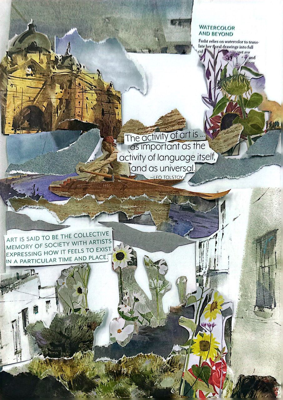
1. Composition #1
Figure 1.11 Week 2 (10/12/2023) Composition #1.
2. Composition #2
Figure 1.12 Week 2 (10/12/2023) Composition #2.
3. Composition #3
Figure 1.13 Week 2 (10/12/2023)Composition #3.
REFLECTION
Experience
Before making the finished result of the collages, it is important to adjust the pieces of the magazine in different directions or places. Because you get ideas that you didn't even think about before.
My first idea is Fig 1.12 but I feel it's too out of place and crowded so I tried to make an attempt to try again, alas I came up with Fig 1.13 but it still looks wrong, if I hadn't done any of these trial adjustment my final result would be Fig 1.12, so I'm glad I did it in the first place.
Observation
Choosing the objects from the magazines is quite hard since the magazine is already the perfect source for a print publication that contains a variety of articles, photographs, and illustrations. Our task is to make a collage that combines a variety of different materials to create a unique work of design.
Findings
Collages can be an effective way to express creativity, views, and experiences. The process of making a physical collage involves cutting or tearing materials in different shapes and sizes. It can also be a way to experiment with different techniques and styles.
FEEDBACK
Specific Feedback, Every composition for collages must have a main headline to tell what is the purpose or theme of the collage itself, you can add small texts or paragraphs but make sure to have a main headline.
General Feedback, before you start creating a collage, it's important to have a clear theme or idea in mind, this will help ensure that all of the elements in the collage work together as a whole. Composition is very important, make sure every element of the collage supports each other.
23.04.2025 - 25.06.2025 week 1 - week 14 Sheryne Axellia Putri / 0367267 / Bachelor of Design (Honours) in Creative Media Creative Brand Strategy Project 4 Quick Links Project 1 Project 2 Project 3 INSTRUCTIONS Project 1 1A: Case Study You are to analyse a well-established Rebranding Campaign of your choosing. 1. Identifying its brand strategy: The Brand Story, Objective & Purpose, Brand Values, Vision & Mission, Target Audience, Brand Positioning. 2. Understanding its brand experience: features and activities. 3. Reviewing its key visuals and the applications: identity and usage from different platforms. 1B: Campaign Proposal You are to propose a Branding Campaign. The campaign will be for a snack of your choosing and may be conceptualised as a rebranding exercise to introduce a new concept or as a new product line launch. ...
24 .04.2025 - 04.07.2025 week 1 - week 11 Sheryne Axellia Putri / 0367267 / Bachelor of Design (Honours) in Creative Media Packaging & Merchandising Design Final Project TABLE OF CONTENTS 1. Instructions 2. Feedback 3. Reflection LECTURES *All lectures are noted in exercise blog. INSTRUCTIONS Final Project Students will build upon the existing packaging design and food product to create a cohesive brand experience through merchandise and promotional initiatives. They will identify opportunities to enhance brand visibility, attract new customers, and foster brand loyalty by designing merchandise items and implementing promotional strategies tailored to the target audience and market context. Students will be required to create FIVE (5) merchandise items, including a POP Display based on Project...
23 .04.2025 - ..2025 week 1 - week 14 Sheryne Axellia Putri / 0367267 / Bachelor of Design (Honours) in Creative Media Publishing Design Exercises TABLE OF CONTENTS 1. Lectures 2. Instructions 1.1 Progress - Writing 2.1 Progress - Illustrations 3.1 Progress - Book 4.1 Progress - Ebook Final Submission 3. Feedback 4. Reflection LECTURES Week 1 23.04.2025_Format There are many forms of publication: books, magazines, and newspapers. Keep in mind that when you design for publication, you have to think of the mass audience. For this semester, we focus on the book format, one of the most important and influential formats. And most important advances in publishing were centered around the book. The Book The book is a medium to document and transmit ideas, knowledge, records, history, and so much ...


Comments
Post a Comment