Digital Photography & imaging [Week 6]
11.09.2023 / week 6
Sheryne Axellia Putri / 0367267 / Bachelor of Design (Honours) in Creative MediaDigital Photography & Imaging
Project 1
Links for every week
4. Week 4
5. Week 5
6. Week 6
LECTURES
Week 6 11.09.2023 - Poster design
The principles of design are the rules a designer must follow to create an effective and attractive composition. The fundamental principles of design are: Emphasis, Balance and Alignment, Contrast, Repetition, Proportion, Movement, and White Space.
A design doesn’t have to strictly follow these rules to be “good” Some absolutely mind-blowing designs ignore one or more design principles to create eye-catching and effective work.

Figure 1.1 Week 6 (11/09/2023) Poster design.
7 principles of poster design:
1. Emphasis, refers to the focal point of a design and the order of importance of each element within a design.

Figure 1.2 Week 6 (11/09/2023) Empahsis in poster design.
2. Balance and alignment, the weight of every element (color, size, texture). without balance, the audience will feel as if their eye is sliding off the page. Symmetrical design creates balance through equally weighted elements aligned on either side of a center line.

Figure 1.3 Week 6 (11/09/2023) Balance & alignment in poster design.
3. Contrast creates space and differences between elements in your design. Your background needs to be significantly different from the color of your elements so they work harmoniously together and are readable.

Figure 1.4 Week 6 (11/09/2023) Contrast in poster design.
4. Repetition, If you limit yourself to two strong typefaces or three strong colors, you’ll soon find you’ll have to repeat some things.

Figure 1.5 Week 6 (11/09/2023) Repetition in poster design.
5. Proportion, This is the visual size and weight or height of elements in a composition and how they relate to each other. It often helps to approach your design in sections, instead of as a whole.

Figure 1.6 Week 6 (11/09/2023) Proportion in poster design.
6. Movement, is controlling the elements in a composition so that the eye is led to move from one to the next and the information is properly communicated to your audience. Movement creates the story or the narrative of your work.

Figure 1.7 Week 6 (11/09/2023) Movement in poster design.
7. White Space, white space (or negative space) is the only one that specifically deals with what you don’t add. White space is exactly that—the empty page around the elements in your composition.

Figure 1.8 Week 6 (11/09/2023) White space in poster design.
TUTORIAL
Figure 1.9 Week 6 (11/09/2023) Tutorial for digital imaging #1.
Figure 1.10 Week 6 (11/09/2023) Tutorial for digital imaging #2.
Figure 1.11 Week 6 (11/09/2023) Tutorial for lighting in photoshoot.
PRACTICAL
Task 2: Digital Imaging Exercise 02 - PART 1
Objective: Turn the B&W photo into a COLOUR photo
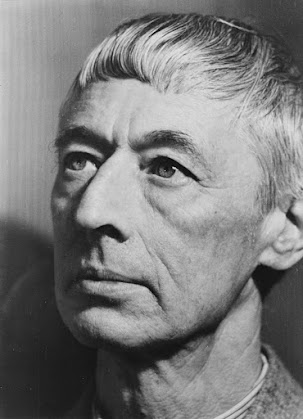 |
| Figure 2.1 Week 6 (11/09/2023) The B&W portrait #1. |
 |
| Figure 2.2 Week 6 (11/09/2023) The progress #1. |
 |
| Figure 2.3 Week 6 (11/09/2023) Layers #1. |
 |
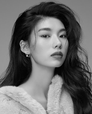
| Figure 2.4 Week 6 (11/09/2023) The finished result #1. |
Objective:
Turn the B&W photo into a COLOUR photo - advanced level.
 |
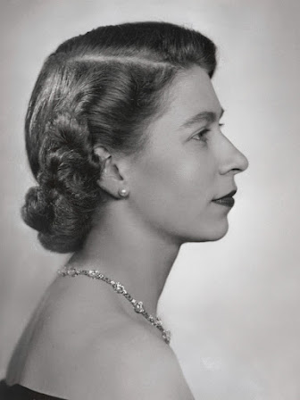
| Figure 2.5 Week 6 (11/09/2023) The B&W portrait #2. |
 |
| Figure 2.6 Week 6 (11/09/2023) The progress #2. |
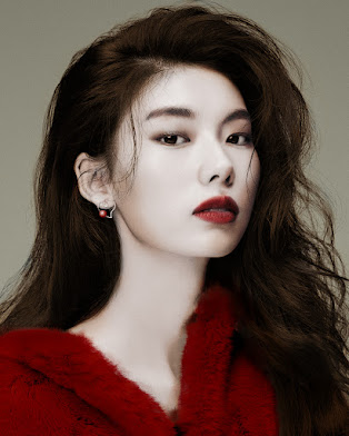 |
| Figure 2.7 Week 6 (11/09/2023) The finished result #2. |
Task 2: Digital Imaging Exercise 02 - PART 2B
Objective:
1. Select ONE B&W photo from the folder:
2. Search photos online for skin/hair references. Recolor the photo for submission.
 |
| Figure 2.8 Week 6 (11/09/2023) The B&W portrait #3. |
 |
| Figure 2.9 Week 6 (11/09/2023) The layers #3. |
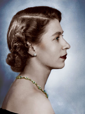 |
| Figure 2.10 Week 6 (11/09/2023) The finished result #3. |
REFLECTION
Experience
When adding color to a black and white photo in Photoshop, the goal is to enhance the visual impact of the image while maintaining a balanced and harmonious appearance. I chose a limited and purposeful color palette. Too many colors can distract from the essence of the photo. Select colors that complement the mood or theme of the image.
Observation
I find it easier to fill the color by learning the color temperature of the light in the original photo. Adjust the colors you add to match the warmth or coolness of the existing black and white tones, ensuring a balance. Also, pay attention to the contrast between the color and grayscale areas. Adjust the contrast of the added colors to avoid overshadowing the details present in the black and white portions of the image.
Findings
I like to use the opacity setting and blend modes to control the intensity of the added color. Experiment with different blend modes such as "Color," "Soft Light," or "Overlay" to achieve the desired effect. Adjusting opacity allows us to find the right balance between the color and the original black and white tones.


Comments
Post a Comment