Advanced Typography [Task 2 : Key Artwork & Collateral]
22.05.2024 - 29.05.2024 / week 5 - week 7
Sheryne Axellia Putri / 0367267 / Bachelor of Design (Honours) in Creative Media
Advanced Typography
TABLE OF CONTENTS


Advanced Typography
Task 2
TABLE OF CONTENTS
INSTRUCTIONS
*All lectures are noted in Task 1
Figure 1.1 Week 5 (05/22/2024) Module Information Booklet.
Task 2:_Key Artwork - Collateral__
- Task 2A: Key Artwork
Explore and compose as many permutations and combinations of your name in the form of a wordmark/lettering. The final key artwork must be an elegant solution, well balanced and
composed, not complicated or confusing that leads to a functional and communicable key artwork. This key artwork will subsequently be used in Task 2(B) collateral.
Create a mind map with your interests, dislikes, and likes, do some research, choose the best branding strategy, and base your ideas on these terms. When creating a wordmark, you are unable to consider any other color when making a decent wordmark: strong/primary colors, narrow spaces, and minimum white spaces are typically utilized for wordmarks, for the collaterals to be relevant to who you are and what you do. You are the brand that something (shirts, bags) links you to.
1.1 Progress
1a.) Mindmap

Figure 1.4 Week 5 (05/222024) Mindmap about myself.
I concluded that I want my wordmark to be mainly perceived as "elegant, consistent, and organized." These are the traits to strive for, as being consistent, organized, and elegant are often seen as desirable qualities in individuals.
Consistency: Being consistent in my actions and behavior shows that I am reliable and can be trusted. It also demonstrates that I am committed to my goals and have a strong sense of discipline.
Organized: Being organized can help me to be more efficient in my work or goals.
Elegance: Being elegant implies that I have good taste and style, which can be appealing to others. It also suggests that I have a level of sophistication and class, which can be a valuable trait in professional and social settings.
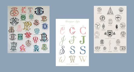
That being said, I can begin by examining what makes a brand appear elegant, consistent, and organized. My first attempt at creating an elegant wordmark was to take inspiration from old monograms. Old monograms often feature simple and classic designs, such as a single initial letter or a combination of initials that are paired together. This simplicity can make them visually appealing and easy to recognize, while also conveying a sense of elegance and sophistication.
#1 Attempt
- Moodboard
My first idea to achieve the theme "elegance" is to follow the idea of a monogram, a monogram design when interlacing and combining alphabet letters. commonly described as an initial.

Figure 1.3 Week 5 (05/22/2024) Moodboard #1.
- Sketch

Figure 1.4 Week 5 (05/22/2024) sketch attempt #1.
After showing my first attempt for feedback, Mr. Vinod said that monograms use only 3 letters as the initials and that the theme I chose didn't describe in my sketches.
#2 Attempt
- Moodboard
My second attempt is listening to the feedback and digging for more elegant inspirations. I figured that by using cursive letters and uppercase letters, the wordmark mostly has a consistent line length.

Figure 1.5 Week 6 (05/27/2024) Moodboard #2.
- Sketch
I have been working on refining my wordmark by creating and developing different concept ideas as part of an ongoing process:
Figure 1.6 Week 6 (05/27/2024) sketch attempt #2.
- #1 The first design attempts to blend the fluidity of cursive with the boldness of uppercase lettering to create a unique visual appeal.
- #2 I took inspiration from the monogram elements, the second design explores incorporating symbolic elements, adding depth and meaning to the overall design.
- #3 An effort to fully embrace the elegance of cursive writing, the third design focuses on utilizing cursive letters in their entirety, showcasing the flowing lines.
- #4 Building upon the third design, the fourth iteration has subtle modifications, creating a sense of variation while maintaining the graceful fluidity of cursive writing.
- #5 Expanding on the concept of combining cursive and uppercase letters.
- #6 The sixth design, while complicated, delves into the details and complex elements. Which is not preferable for a wordmark.
- #7 Infused with a sharp touch, the seventh design exudes a sense of edginess and modernity, adding a striking visual element to the wordmark.
- #8 Simple design elements to create a basic visual composition.

Figure 1.7 Week 6 (05/27/2024) The selected design.
I asked my friends which design out of them all screams "elegant" and "organized". Most of them chose #3 and #7. And thus I continue developing my wordmark.
#3 Attempt
I've been thinking with somewhat of a concept that probably will fail miserably. But it keeps crossing my mind. I'm considering creating a wordmark based on an ornament design I've come up with. While researching monograms, I stumbled upon the fascinating world of ornaments and it got me thinking.
- Moodboard

Figure 1.8 Week 6 (05/27/2024) Moodboard #3.
- Sketch & digitization

Figure 1.9 Week 6 (05/27/2024) digitization attempt #3.

Figure 1.10 Week 6 (05/27/2024) Digitization result of #3.
#4 Attempt
The feedback from class is what I really need because I'm so lost about the theme of my wordmark. I was instructed to change the layout to increase readability.

Figure 1.11 Week 6 (05/29/2024) Feedback attempt #4.
#5 Attempt
This last attempt I swear, I've decided to make a final attempt to revise the design. I've realized that I no longer prefer using cursive fonts and would like to revert to the previous design that was chosen.

Figure 1.12 Week 6 (05/29/2024) Digitization process #5.
In a previous attempt, I incorporated an element for the letter 'A,' but upon further consideration, I opted to solely emphasize the letter 'x' in my wordmark design.
I use https://colorhunt.co/ to choose my color palette, and this is the palette that piqued my interest. But I notice it is lacking contrast so that's why I changed the value.

Figure 1.13 Week 6 (05/29/2024) The chosen color palette.

Figure 1.14 Week 6 (05/29/2024) The chosen color palette (edited).

Figure 1.15 Week 6 (05/29/2024) The wordmark with different color palettes.
1.2 Wordmark Final Outcome

Figure 1.16 Week 6 (05/29/2024) Wordmark in the lightest shade.

Figure 1.17 Week 6 (05/29/2024) Wordmark in the darkest shade.
- Task 2B: Key Artwork & Collateral
1.1 Progress
- Moodboard

Figure 1.18 Week 7 (06/03/2024) Wordmark in the darkest shade.
The reason why I may want to focus my product collateral on a perfume brand is so that I can establish a luxury brand image through perfume bottles. A perfume brand has the potential to provide customers with a memorable and luxurious experience through the use of elegant and sophisticated branding materials such as business cards, and tote bags.
- Brand logo

Figure 1.19 Week 7 (06/03/2024) Brand logo options.
The logo is a combination of the letters 'A' and 'X' which I realized the logo could be read as "Axel" as well. The X could be recognized as 'E' and 'L'.

Figure 1.20 Week 7 (06/03/2024) Brand logo.
- Business card

Figure 1.21 Week 7 (06/03/2024) Business card collateral progress.
I manually edited the collateral using Photoshop, I really like the card textures I did even though it's not that noticeable.
- Perfume

Figure 1.22 Week 7 (06/03/2024) Brand logo on the product.
Made another logo design that will be on the perfume bottle and box. I manually edited my collateral using Photoshop again.

Figure 1.23 Week 7 (06/03/2024) Perfume collateral progress.
- Tote bag

Figure 1.24 Week 7 (06/03/2024) Tote bag design options.
- Identity expansion (for IG post)

Figure 1.25 Week 7 (06/03/2024) Identity expansion options.

Figure 1.26 Week 7 (06/03/2024) Final Identity expansion.

Figure 1.27 Week 7 (06/03/2024).

Figure 1.28 Week 7 (06/03/2024) Instagram feed.
- Animated GIF

Figure 1.29 Week 7 (06/03/2024) The making of wordmark animation.

Figure 1.30 Week 7 (06/03/2024) Gif final.
3.1 FINAL OUTCOMES
- Task 2A: Key Artwork

Figure 1.31 Week 7 (06/05/2024) Black wordmark on white background.

Figure 1.32 Week 7 (06/05/2024) White wordmark on black background.

Figure 1.33 Week 7 (06/05/2024) Colour palette.

Figure 1.34 Week 7 (06/05/2024) Wordmark in actual colors on lightest shade of color palette.

Figure 1.35 Week 7 (06/05/2024) Wordmark in the lightest shade of the color palette on the darkest shade.

Figure 1.36 Week 7 (06/05/2024) Wordmark animation.
- Task 2B: Key Artwork & Collateral

Figure 1.37 Week 7 (06/05/2024) #1 Collateral, business card.

Figure 1.38 Week 7 (06/05/2024) #2 Collateral, perfume.

Figure 1.39 Week 7 (06/05/2024) #3 Collateral, tote bag.
- Instagram Link: https://www.instagram.com/axel_typodesign/
Figure 1.40 Week 7 (06/05/2024) Instagram account.
FEEDBACK
Week 5 05.22.2024
- General feedback, The wordmark should be easily readable and should accurately represent the identity it is associated with. It should also be memorable and leave a lasting impression. Pay attention to the shape of the letters, and the space between them.
- Personal feedback, Monograms use only 3 letters as the initials and the theme I chose wasn't described in my sketches. He said that elegant mostly simple but stylish. And that some of my wordmark sketches look like tree branches or veins.
Week 6 05.29.2024
- General feedback, Choosing a color palette needs to be appropriate to its context and the overall theme. Use primary colors to make your wordmark have contrast.
- Personal feedback, The wordmark is unreadable, it doesn't represent what it meant nor it's elegant. The A looks fine, which is the only readable part of the wordmark. The name "Axel" usually fits in the form of spiky shapes rather than in cursives.
Week 7 06.05.2024
- General feedback, Choosing collateral needs to fit the theme of your wordmark, and make sure the logo brand for your collateral is recognizable as your name, and the color palette of your wordmark should match with the product.
REFLECTION
Experience
I went through several iterations, playing around with different shapes, colors, and layouts, until I eventually landed on a design that felt like it truly embodied the elegance, consistency, and organization that I was going for. Once I had settled on a design that felt right, I refined it and polished it up, adding in the finishing touches and details that brought it to life. Overall, the whole process of creating my elegant wordmark was an incredibly rewarding and fulfilling experience.
Observation
Before creating a wordmark, it's important to have a clear understanding of your brand, its values, and the message you want to convey. This will help you to develop a concept for your wordmark that reflects your brand's identity.
Findings
- The colors you choose for your design can have a big impact on the overall feel of your brand. Use a limited color palette to create a cohesive and elegant look.
- Elegant design is all about simplifying the visual elements in your design to make them more impactful. Focus on the main design elements, and don't overwhelm the design with too many details.
FURTHER READING


Comments
Post a Comment