Advanced Typography [ Task 3 : Type Exploration & Application ]
19.06.2024 - 24.07.2024 / week 9 - week 14
Sheryne Axellia Putri / 0367267 / Bachelor of Design (Honours) in Creative Media
Advanced Typography
TABLE OF CONTENTS
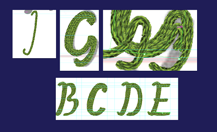
I fixed some mistakes before continuing to add the other letters.
Advanced Typography
Task 3
TABLE OF CONTENTS
1. Lectures
2. Instructions
3. Feedback
4. Reflection
INSTRUCTIONS
Figure 1.1 Week 9 (06/19/2024) Module Information Booklet.
Allow the knowledge gained to guide and inform your decisions for the effective execution of your final task:
- Create a font that is intended to solve a larger problem or is meant to be part of a solution in the area of your interest or any other related area not necessarily reflecting your specialization.
- Explore the use of an existing letterform in an area of interest, understand its existing relationship, identify areas that could be improved upon, and explore possible solutions or combinations that may add value to the existing letterform/lettering.
- Experiment. For your idea to qualify as an experiment, it must be novel and unique while working with material that might be 3 dimensional, digitally augmented, edible, unusual, typographic music video, or fine art.
1.1 Progress
1a.) Proposal
Figure 1.2 Week 9 (06/19/2024) Proposal.
After reviewing my proposal, I decided to proceed with the second idea, which involves creating an embroidery font.
#1 Attempt
#1a Sketch
Figure 1.3 Week 10 (06/26/2024) Sketches for the first attempt.
#1b Digitization
In my project proposal, I set out to create letterforms using textured brushes. However, I've encountered some difficulty in finding the right textured embroidery brush as they are not easy to come by. The free brush I am currently using has limited colors, but I am working on enhancing the depth of the letters by incorporating numerous lines. This technique also helps in making the letterforms appear thicker and more pronounced.
Figure 1.5 Week 10 (06/26/2024) Finished result for the first attempt.
After receiving feedback on my first attempt, I learned that using texture is not allowed or recommended due to the potential lack of support for this type of format in FontLab. Additionally, the texture I used appears pixelated from a distance, which could compromise the quality when exporting to FontLab.
#2 Attempt
Since my first attempt at creating a realistic threaded font won't work because I have to make textures, I have to change my proposal and solution again. After some thought my new proposal would be:
To make a modernized embroidery font that can be used in a variety of applications. By using a font style like sans serif, a wide range of purposes, including branding, graphic design, social media content, and even embroidery clothes mock-ups. By using a sans-serif style, to create a contemporary and sleek look that feels modern and fresh yet still maintains the craftsmanship and detail of traditional embroidery.
After receiving feedback, if I still wanted to go with creating an embroidery font, one technique was to make my own pattern brush. I went searching for references and research for embroidery patterns. So I looked at traditional embroidery stitches and see which ones I thought would translate well into a modernized font, also took inspiration from embroidery patterns and designs.
Figure 1.7 Week 11 (07/03/2024) 15 types of embroidery stitches.
I found an article that explains 15 basic embroidery stitches that every beginner should know. It provides instructions and illustrations for each stitch, This article guides me to easily differentiate the basic embroidery stitches.
These stitches provide a solid foundation for creating various embroidery projects, from simple outlines to complex textures and patterns.
Figure 1.8 Week 11 (07/03/2024) Fly stitch & chain stitch.
I'm interested in these two stitches and plan to combine them in one design for my font. The fly stitch could be used as the geometrical element that could show the modern look more.
Figure 1.9 Week 11 (07/03/2024) The progress of making my own brush pattern.
This is the initial shape I began working on. However, after exporting it as a pattern brush, I realized that it didn't quite capture the essence of embroidery patterns as I had hoped. After more arrangements, I was finally satisfied with how the pattern will look.
Figure 1.10 Week 11 (07/03/2024) Exporting the pattern as a brush.
I then attempted to create another pattern brush using the same shape, but this time I added more details and weight to it. Mr. Vinod suggested that I create an additional pattern brush in case I need to work on a circular letter, ensuring that the weight remains consistent with the other letters.
key characteristics that I want to achieve:
- The font lacks the small projecting features at the end of strokes, which gives it a clean and modern look.
- The overall aesthetic is modern and geometric, with precise and symmetrical shapes.
- The stitches are evenly spaced, contributing to the readability of the text.
- The font is bold enough to stand out and be easily read, making it versatile for various design contexts.
While working on the letters, I encountered difficulties in adjusting the vector due to the complexity of the pattern.
Figure 1.13 Week 12 (07/09/2024) Comparison of the development.
A. Comparison of "V"
- Left "V": The "V" is constructed with a series of overlapping stitches that are aligned closely together.
- Right "V": The stitches are more spaced out and align with the top and bottom, giving the letter a more open appearance.
B. Comparison of "f"
- Left "f": The "f" is fully formed with dense stitches at the top.
- Right "f": This "f" has a different approach, with an adjusted stroke thickness or a more compact arrangement of the stitches at the top.
C. Comparison of "M" and "N"
- Top "M&N": Both letters "M" and "N" are constructed with the stitches densely packed together, creating a solid form.
- Bottom "M&N": In this set, the stitches appear to have more space between them, resulting in a lighter visual appearance.
D. Comparison of "S"
- Left "S": The "s" has a consistent pattern of stitches throughout, with a uniform thickness. The form is the most round than the others.
- Middle "S": This version shows a slightly different curvature or alignment of the stitches, possibly creating a variation in thickness.
- Right "S": This "S" seems to have more spacing between the stitches, giving it a more open and less dense appearance.
Figure 1.14 Week 12 (07/09/2024) Comparison of the development #2.
Figure 1.16 Week 12 (07/09/2024) Final result.
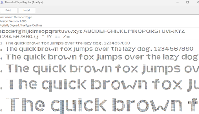
1d.) Fontlab
Figure 1.17 Week 13 (07/16/2024) Exporting the font from Adobe to fontlab.
1d.) Font Presentation
Figure 1.19 Week 14 (07/23/2024) Font presentation 1.
Figure 1.20 Week 14 (07/23/2024) Font presentation 2.
Figure 1.21 Week 14 (07/23/2024) Font presentation 3.
Figure 1.22 Week 14 (07/23/2024) Font presentation 4.
Figure 1.23 Week 14 (07/23/2024) Font presentation 5.
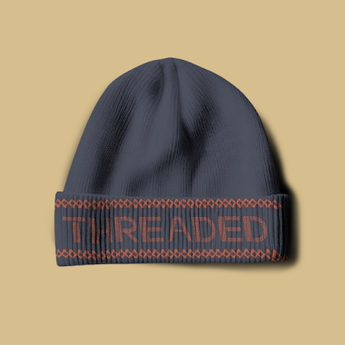
1e.) Font Application
Figure 1.24 Week 14 (07/23/2024) Font Application 1.
Figure 1.25 Week 14 (07/23/2024) Font Application 2.
Figure 1.25 Week 14 (07/23/2024) Font Application 3.
Figure 1.27 Week 14 (07/23/2024) Font Application 5.
FEEDBACK
Week 9
- General feedback, Read the MIB carefully and about what purpose and the solution for your font.
- Personal feedback, For the ransom font, it is already been done. It's best to work on the embroidery font and explore.
Week 10
- General feedback, Use a grid to make each letter compliment each other.
- Personal feedback, Using texture is not permissible, and what is your purpose for making an embroidery font? elaborate more.
Week 11
- Specific feedback, Make another pattern brush with different numbers of the pattern so it's easier to adjust the circular letter.
Week 13
- Specific feedback, Because my font is already complex, for my font presentation it is best to make the text bigger with a simple layout.
REFLECTION
Experience
My experience in making my own modern embroidery font sounds exciting and challenging. I have to put a lot of thought and effort into creating a font that really captures the look and feel of embroidery., and figure out how to translate that into a digital font. It took the time and effort it took to create each letter and digit with such precision.
Observation
This task is that it involved a lot of planning, creativity, and hard work, so I was able to translate the intricate details of embroidery into a digital format.
Findings
As I dug deeper into the process of making my own modern embroidery font, I found that it required a deep understanding of the anatomy of each letter, as well as a keen eye for detail. The process involved a lot of trial and error, but ultimately it was rewarding to see the final product come to life.


Comments
Post a Comment