22.04.2024 - 15.05.2024 / week 1 - week 4
Sheryne Axellia Putri / 0367267 / Bachelor of Design (Honours) in Creative MediaAdvanced TypographyExercises
Week 1 22.04.2024 Typographic Systems
There are eight major variations with an infinite number of permutations:
- Axial
- Radial
- Dilatational
- Random
- Grid
- Modular
- Transitional
- Bilateral
The typographic systems are akin to what architects term shape grammars. The typographic systems are similar in that the systems have a set of rules that is unique and provides a sense of purpose that focuses and directs the decision making." (Elam. 2007)
A shape grammar is a set of shape rules that apply in a step-by-step way to generate a set or language, of designs.
While some may feel this imposition takes away intuition from a teaching point of view it provides a solid framework that allows learners to be guided in their exploration while their intuition develops and matures.
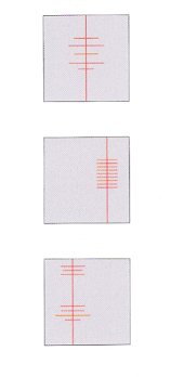
Axial System: all elements are organized to the left or right of a single axis. The examples here are courtesy and have been sourced from Type 365.
The axial system is one of the simplest systems. All elements are organized either to the left or right of a single axis.
The axis can exist anywhere in the format to create a symmetric or asymmetric composition.
The Axis system reveals that asymmetric arrangements are often more interesting than symmetrical ones.
Figure 1.1 Week 1 (04/22/2024) Axial System.
Figure 1.2 Week 1 (04/22/2024) Axial System#2.
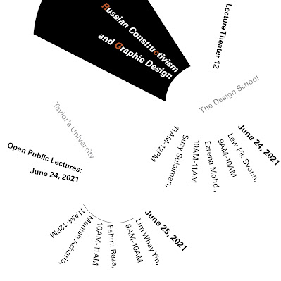
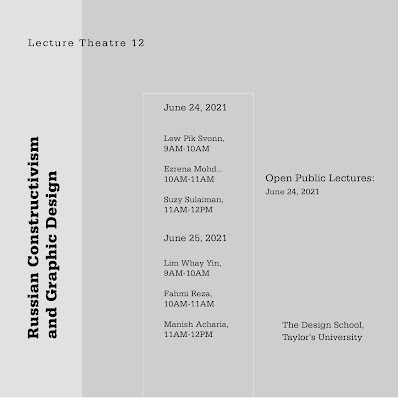
Radial System: All elements are extended from a point of focus. All elements are organized to extend from a center point of focus like rays. The compositions are dynamic, as the eye is drawn to the focal point of the radial composition. The point can be implied or depicted.Figure 1.3 Week 1 (04/22/2024) Radial System.
Strong diagonal direction is inherent in radial compositions, they are visually active and dynamic. Radial compositions are difficult to read and are appropriate for visual messages with limited amounts of text.
Figure 1.4 Week 1 (04/22/2024) Radial System#2.
Figure 1.5 Week 1 (04/22/2024) Radial System sample by designer Tamara Audrey
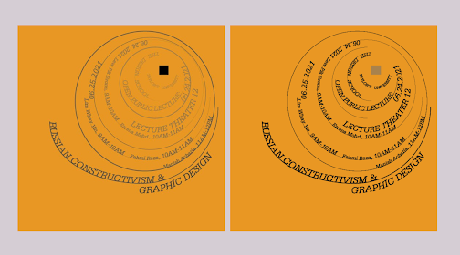
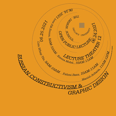
Dilatational System: All elements expand from a central point in a circular fashion. The simplest forms of the dilatational system are circles that expand in regular or rhythmical elements from the center.
Figure 1.6 Week 1 (04/22/2024) Dilatational System.
The dilatational system becomes the structure for the placement of groups of text and similar-sized circles are used in all of the groups. The most readable dilatational compositions bring a sense of order to the text through composition. The use of alignment can create order through interior axes in a composition.
Figure 1.7 Week 1 (04/22/2024) Dilatational System#2.
Figure 1.8 Week 1 (04/22/2024) Radial System.
Random System: Elements appear to have no specific pattern or relationship, and consist of elements that are arranged without a definite aim, pattern, direction, rule, method, or purpose.
Figure 1.9 Week 1 (04/22/2024) Random System.
Overlapping and cropping are natural occurrences in compositions with multiple angles and are some of the strongest random cues, Intentional typographic composition designed to communicate rarely overlaps or is cropped because readability is often inhibited.
Figure 1.10 Week 1 (04/22/2024) Random System#2.
Figure 1.11 Week 1 (04/22/2024) Radial System sample by designer Tamara Audrey
Far right: Vedha Vania
Grid System: A system of vertical and horizontal divisions. The arrangements are usually formal and ar intended to create a visual order and economy in production, Ex: windows, maps, crossword, puzzles, and frequently used in publication design and web design/
Figure 1.12 Week 1 (04/22/2024) Grid System.
Grid systems are different from the axial system in that the visual relationships are not tied to a single axis and usually employ more than a single column. Grid frameworks need to be flexible because information is variable and subject to viewer selection. Issues of navigation and changes in the volume of the text make design problematic.
Figure 1.13 Week 1 (04/22/2024) Grid System #2.
Figure 1.14 Week 1 (04/22/2024) Grid System sample by designer Tamara Audrey.
Transitional System: An informal system of layered banding. There are no interrelationships along an axis or edge alignments, and elements move freely left and right. Compositions can be airy and widely leaded or tightly compact, which emphasizes the negative space.
Figure 1.15 Week 1 (04/22/2024) Transitional System.
The transitional system is the most informal and relaxed because the elements are not required to align on any axis.
Figure 1.16 Week 1 (04/22/2024) Transitional System#2.
One of the strongest traits of the transitional system is a sense of movement. Since there are no strong vertical alignments to create a visual stop.
Figure 1.17 Week 1 (04/22/2024) Transitional System.
Modular System: A series of non-objective elements that are constructed as standardized units. The idea is to standardize the unit on which the typography rests and then compose the message with the modules.
Figure 1.18 Week 1 (04/22/2024) Modular System.
Figure 1.19 Week 1 (04/22/2024) Modular System#2.
Figure 1.20 Week 1 (04/22/2024) Modular System sample by designer Tamara Audrey, Far right: Julius Teoh Hoong Boon.
Bilateral System: All text is arranged symmetrically on a single axis. Due to the inherent symmetry that makes these compositions predictable and potentially uninteresting.
Figure 1.21 Week 1 (04/22/2024) Bilateral System.
Figure 1.22 Week 1 (04/22/2024) Bilateral System#2.
Figure 1.23 Week 1 (04/22/2024) Bilateral System sample by designer Tamara Audrey, Far right top: Tamara Audrey, Far right bottom and below: Vedha Vania.
Many designers focus primarily on the arid system for the design and are unaware of the potential that other systems hold. This here system is one of many possibilities that affords some level of distinctiveness from the grid systems in certain situations
An understanding of the systems organization process allows the designer to break free from "the rigid horizontal and vertical grid systems of letterpress" (Elam, 2007). It allows designers to use more fluid means to create typographic messages
Week 2 01.05.2024_Typographic Composition
Principles of Design Composition
The abstract notions (emphasis, isolation, repetition, symmetry and asymmetry, alignment, and perspectives) seem ambiguous when translated into typographic layouts or composition. They seem more relevant to imagery than complex units of information that consist of different elements.
The ideas mentioned above and the application of these ideas into real-life content (images, textual information, and color) on a page or screen can sometimes feel disparate. Some of these principles are a little more easily translatable than others
Figure 1.24 Week 2 (01/05/2024)
The Rule of Thirds → is a photographic guide to composition, it basically suggests that a frame (space) can be divided into 3 columns and 3 rows. The intersecting lines are used as a guide to place the points of interest, within the given space
Figure 1.25 Week 2 (01/05/2024)
Realistically no one would ever use the rule of thirds when there are other more favorable options.
Typographic Systems
These 8 systems we have covered in depth in theory and practical From the 8 systems the most pragmatic and the most used system is the Grid System (or Raster Systeme), which is derived from the grided compositional structure of Letter Press printing.
It was further enhanced by what has now come to be termed as the Swiss (Modernist) style of Typography, with its foremost proponents being Josef Muller Brockmann, Jan Tschichold, Max Bill, and such.
Figure 1.26 Week 2 (01/05/2024)
While the Grid System may seem to be old or rigid, the versatility of the system and its (to some degree) modular nature tends to allow an infinite number of adaptations. This is why it continues to remain popular.
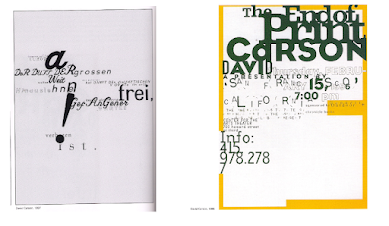
In reaction to this very ordered approach to the Typography of the modernist era, a group of younger designers began to question and challenge this notion of order. Thus, the post-modernist era in Typographical systems where chaos, randomness, and asymmetry were explored. Legibility and readability were relegated to the back seat however the best examples seem to combine the two seamlessly. Its proponents include David Carson, Paula Scher, and Jonathan Barnbrook, to name a few.
There was a method to their madness. Order was replaced with apparent chaos but this chaos was exciting and 'new' for a generation that was being exposed to Punk anti-establishment thought and music. As such the asymmetry, random, repetition, dilatational, and radial systems began to take root in the lexicon of designer
Figure 1.27 Week 2 (01/05/2024)
Left to right: Paula Scher, Jonathan Bambrook, and David Carson.
Other models/Systems
Environmental Grid
This system is based on the exploration of an existing structure or numerous structures combined. An extraction of crucial lines both curved and straight is formed. The designer then organizes his information around this super-structure, which includes non-objective elements to create a unique and exciting mixture of texture and visual stimuli.
It is an interesting manner of exploration and provides context to the forms developed in the design why? Because the system/structures were developed around key features of an environment associated with the communicators of the message
Figure 1.28 Week 2 (01/05/2024)
An example is from lecturer Brenda McMannus, of Pratt Inst. from the book: Typographic Form and Communication. pp211
Form and Movement
This system is based on the exploration of an existing Grid System. I developed this system to get students to explore, the multitude of options the grid offers; to dispel the seriousness surrounding the application of the grid system; and to see the turning of pages in a book as a slowed-down animation in the form that constitutes the placement of image, text and color.
The placement of a form (irrespective of what it is) on a page, over many pages, creates movement. Whether the page is paper or screen is irrelevant
Figure 1.29 Week 2 (01/05/2024)
Static versions of the form were placed on spread (Grids were hidden). Care was taken to ensure visual connections and surprises on every page, The forms could represent images text, or color. Right: Animated version, the spreads of a book mimic, then dummy text, and so on.
Figure 1.30 Week 2 (01/05/2024)
The level of complexity increases as newer elements are introduced incrementally: additions of one color, then an image, then dummy text, and so on.
Week 3 08.05.2024_Context & Creativity
Handwriting →studying handwriting is important because the first mechanically produced letterforms were designed to directly imitate handwriting. Handwriting is the standard basis for form, spacing, and mechanical type conventions that we try to mimic.
Letterforms shape and line are influenced by the tools and materials used to make them. Some tools that contributed to the unique characteristics of the letterform are Sharpened bones, Charcoal sticks, Plant stems, Brushes, Feathers, and steel pens.
Another factor that contributed to the unique characteristics of the letterform lies in the material it was written on, such as clay, papyrus, palm leaf, animal skins (vellum and parchment), and paper.
Figure 1.31 Week 3 (08/05/2024)
Cuneiform (3000 B.C.E) The earliest system of actual writing, was used in a number of languages between the 34C. B.C.E. through the 1st century C.E. Its distinctive wedge form was the result of pressing the blunt end of a read stylus into wet clay tablets. The cuneiform characters evolved from pictograms. Cuneiform was written from left to right.
Figure 1.32 Week 3 (08/05/2024)
Hieroglyphics (2613-2610 B.C.E.) The Egyptian writing system is fused with the art of relief carving. The system was a mixture of both rebus and phonetic characters - the first link to a future alphabetic system. Hieroglyphic images have the potential to be used in three different ways :
- As ideograms, to represent the things they actually depict.
- As determinatives to show that the signs preceding are meant as phonograms and to indicate the general idea of the word.
- As phonograms to represent sounds that “spell out” individual words.
Figure 1.33 Week 3 (08/05/2024)
Early Greek / 5th C. B.C.E.: These early Greek letters were drawn freehand, not constructed with compasses and rule, and they had no serifs neither the informal entry and exit strikes left by a relaxed and fluent writer, nor the symmetrical finish stroke typically added to letters by formal scribes.
Roman Uncials: By the 4th century Roman letters were becoming more rounded, the curved form allowed for fewer strokes and could be written faster.
English Half Uncials, 8th C.: In England, the uncial evolved into a more slanted and condensed form. While English and Irish uncials evolved, writing on the European continent devolved considerably and needed a reformer.
Carolingian Minuscule: Capitals at the start of a sentence, spaces between words, and punctuation. This was used for all legal and literary works to unify communication between the various regions of the expanding European empire.
Black Letter (12-15 C. CE): The vertical supplanted horizontals as the dominant line in architecture; the pointed arch replaced the round arch of the Romans; the almond shape, or mandarin, was preferred. This is characterized by tight spacing and condensed lettering. Evenly spaced verticals dominated the letterform.
The Italian Renaissance: This is the form that was being applied to art and architecture resulting in a more perfect or rationalized letter.
- Evolution of Middle Eastern Alphabets: It is also important to note that while the Phoenician letter marks a turning point in written language, the use of sound represented in letters, the script itself has been possibly influenced by the Egyptian Hieroglyphics and Hieratic Scripts.
Figure 1.34 Week 3 (08/05/2024)
- The evolution of the Chinese script: from the oracle bone to seal script to clerical script, traditional and simplified scripts.
Figure 1.35 Week 3 (08/05/2024)
- The oldest writing found in the ‘Indian’ subcontinent the Indus Valley Civilization (IVC) script (3500-2000 BCE), is as yet undeciphered and seems to have been somewhat logo-syllabic in nature.
Figure 1.36 Week 3 (08/05/2024)
- The Brahmi script (450-350 BCE) is the earliest writing system developed in India after the Indus script. It is one of the most influential writing systems of all modern Indian scripts and several hundred scripts found in Southeast and East Asia are derived from Brahmi.
Figure 1.37 Week 3 (08/05/2024)
- Southeast Asia Scripts, scripts of the communities that assimilated into Peninsula Malay communities → Rajang script, Batak script, Bugis script (Lontara), and Javanese script.
Week 4 15.05.2024_Designing Type
According to Xavier Dupré (2007), these are the two reasons for designing a typeface :
- Type design carries a social responsibility so one must continue to improve its legibility.
- Type design is a form of artistic expression.
Adrian Frutiger is a renowned twentieth-century Swiss graphic designer. His forte was typeface designing and he is considered responsible for the advancement of typography into digital typography. His valued contribution to typography includes the typefaces Univers and Frutiger.
Frutiger is a sans serif typeface designed in 1968 for the newly built Charles de Gaulle International Airport in France, the purpose is to create a clean, distinctive, and legible typeface that is easy to see from both close up and far away.
Figure 1.38 Week 4 (15/05/2024)
- Consideration/Limitations: letterforms needed to be recognized even in poor light conditions or when the reader was moving quickly past the sign.
Matthew Carter is the son of Harry Carter. Many of his fonts were created to address specific technical challenges, for example, those posed by early computers, Verdana (1996) for Microsoft. The purpose is to be extremely legible even at very small sizes on the screen due in part to the popularity of the internet and electronic devices.
Figure 1.39 Week 4 (15/05/2024)
- Consideration/Limitations: The Verdana fonts exhibit characteristics derived from the pixel rather than the pen, the brush, or the chisel. Commonly confused characters, such as the lowercase i, j, l.
Edward Johnston is the creator of the hugely influential London “Underground” typeface, which would later come to be known as “Johnston Sans” (1916). The purpose is because London’s Underground Railway ordered a new typeface for its posters and signage from the calligrapher Edward Johnston. He handed over details and examples of letter shapes that would set the tone for printed text until today.
Figure 1.40 Week 4 (15/05/2024)
- Consideration/Limitations: Johnston’s remit was to unite the London Underground Group, the different companies all using the same rails and tunnels.
Process of Type Design:
1. Research
Understand type history, type anatomy, and type conventions. It is important to determine the type’s purpose or what it would be used for, what different applications it will be used in such as whether the typeface is for school busses or airport signages, etc.
2. Sketching
Traditional: Some designers sketch their typeface using the traditional toolset (brushes/pens, ink, and paper) and then scan them for the purpose of digitization.
Digital: Some designers sketch their typeface using digital tool sets, such as Wacom directly into a font design software (quicker, persistent, and consistent) but this can sometimes impede the natural movement of hand strokes.
3. Digitization
There are professional software that are used in the digitization of typefaces (Fontlab and Glyphs app). Some designers also use Adobe Illustrator to design or craft letterforms and then introduce them to specialized font apps.
4. Testing
This is an important component in the design thinking process. The results of the testing is part of the process of refining and correcting aspects of the typeface. Prototyping is also part of the testing process and leads to important feedback. Depending on the typeface category, the readability and legibility of the typeface become an important consideration.
5. Deploy
Even after deploying a completed typeface there are always teething problems that did not come to the fore during the prototyping and testing phases. Thus, the task of revision doesn’t end upon deployment.
Typeface Construction
- Using grids (with circular forms) can facilitate the construction of letterforms and is a possible method to build/create/design your letterforms.
- Roman Capital: The grid consists of a square, and inside it a circle that just touches the lines of the square in places. Within the square, there is also a rectangle. This rectangle is three-quarters the size of the square and is positioned in the center of the square.
Figure 1.41 Week 4 (15/05/2024)
Construction and Consideration
Depending on their form and construction, the 26 characters of the alphabet can be arranged into groups, whereby a distinction is made between a group for the capitals and a group for lowercase letters.
Figure 1.42 Week 4 (15/05/2024)
Different forms and constructions must be taken into account when designing a new type. An important visual. Correction is the extrusion of curved (and protruding) forms past the baseline and cap line.
A visual correction is also needed for the distance between letters. It is not possible to simply place letters next to each other with equal spacing between them. The letters must be altered to a uniform ‘visual’ white space. This means that the white space between the letters should appear the same. This is called “fitting” the type.
Week 5 22.05.2024_Percwption & Organization
Perception in typography deals with the visual navigation and interpretation of the reader via contrast, form, and organization of the content. Content can be textual, visual, graphical, or in the form of color.
Figure 1.43 Week 5 (22/05/2024)
There are several methods in typography to create contrast. If there is no contrast in a book, the reader will have difficulty separating different types of information.
Figure 1.44 Week 5 (22/05/2024)
Carl Dair adds two more principles into the mix; texture and direction. Dair posits 7 kinds of contrast which are size, weight, contrast of form, contrast of structure, contrast of texture, contrast of color, and contrast of direction.
Form → refers to the overall look and feel of the elements that make up the typographic composition. It is the part that plays a role in visual impact and first impressions. A good form of typography tends to be visually intriguing to the eye; it leads the eye from point to point, entertains the mind, and is most often memorable.
Typography can be seen as having two functions:
- To represent a concept
- To do so in a visual form
The interplay of meaning and form brings a balanced harmony both in terms of function and expression. When a typeface is perceived as a form, it no longer reads as a letter because it has been manipulated by distortion, texture, and enlargement, and has been extruded into a space.
Figure 1.45 Week 5 (22/05/2024)
Organization/Gestalt → Gestalt psychology is an attempt to understand the laws behind the ability to acquire and maintain meaningful perceptions. Gestalt theory emphasizes that the whole of anything is greater than its parts.
Perceptual Organization / Grouping :
- Law of Similarity: Elements that are similar to each other tend to be perceived as a unified group, and can refer to any number of features (color, orientation, size, or indeed motion.
- Law of Proximity: Elements that are close together tend to be perceived as a unified group. This straightforward law states that items close to each other tend to be grouped together, whereas items further apart are less likely to be grouped together.
- Law of Closure: The mind’s tendency to see complete figures or forms even if a picture is incomplete.
- Law of Continuation: Humans tend to perceive each or two or more objects as different, singular, and uninterrupted objects even when they intersect.
- Law of Symmetry
- Law of Simplicity (Praganz)

Figure 1.46 Week 5 (22/05/2024)
Figure 2.1 Week 1 (04/22/2024) Module Information Booklet.
Task 1: Exercises__Typographic Systems - Type & Play__
- EXERCISE 1: Typographic Systems
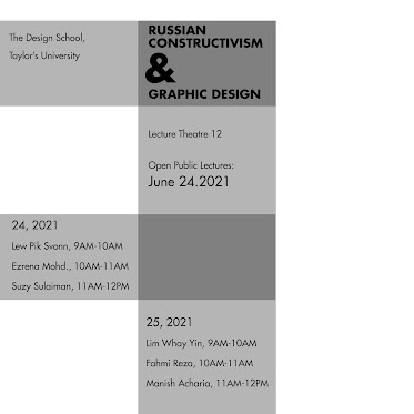
Our first exercise is to create each Typographic System (Axial System, Radial System, Dilatational System, Random System, Grid System, Transitional System, Modular System, and, Bilateral System.)
The exercise task is to be done using Adobe InDesign only.
- Size: 200 x 200 mm.
- In addition to black, you can use one other color.
- Graphical elements (line, dot, etc.) can be used but limitedly.
Figure 2.2 Week 1 (04/22/2024) Contents that can used to explore.
1.1 Progress
1a.) Research
Firstly I searched each of the contents and their purposes, I chose Russian Constructivism and Graphic Design because I think the headline is perfect for a simplistic direction.
Russian Constructivism was a pioneering art movement from early 20th century Russia, that lasted roughly from 1915-1930. Leading artists, including Vladimir Tatlin and Alexander Rodchenko, explored a new, constructed language of geometry, making angular sculptures from scraps and shards of industrial materials. https://www.thecollector.com/what-is-russian-constructivism/
Figure 2.3 Week 1 (04/22/2024) El Lissitzky's poster Beat the Whites with the Red Wedge (1919).
I use Behance.net and Pinterest as my source of inspiration, I really dig the minimalistic theme and the creative way of using negative space from the works I have found.
Figure 2.4 Week 1 (04/22/2024) Moodboard.
Sources:
1b.) Digitization
Figure 2.5 Week 1 (04/22/2024) Progress for Axial System.
Figure 2.6 Week 1 (04/22/2024) Progress for Dilatational System #1.
Figure 2.7 Week 2 (04/29/2024) Progress for Radial System.
Figure 2.8 Week 2 (04/29/2024) Progress for Dilatational System #2.
Figure 2.9 Week 2 (04/29/2024) Progress for Grid System.
Figure 2.10 Week 2 (04/29/2024) Progress for Transitional System.
Figure 2.11 Week 2 (04/29/2024) Progress for Modular System.
1c.) Outcomes
Axial System
Figure 2.12 Week 2 (04/29/2024) Axial System #1.
Figure 2.13 Week 2 (04/29/2024) Axial System #2.
Figure 2.14 Week 2 (04/29/2024) Axial System #3.
Radial System
Figure 2.15 Week 2 (05/01/2024) Radial System adjustment #1.
Figure 2.16 Week 2 (05/01/2024) Radial System final #1.
Figure 2.17 Week 2 (05/01/2024) Radial System adjustment #2.
Figure 2.18 Week 2 (05/01/2024) Radial System final #2.
Figure 2.19 Week 2 (05/01/2024) Radial System final #3.
Dilatational System
Figure 2.20 Week 2 (05/01/2024) Dilatational System adjustment #1.
Figure 2.21 Week 2 (05/01/2024) Dilatational System final #1.
Figure 2.22 Week 2 (05/01/2024) Dilatational System adjustment #2.
Figure 2.23 Week 2 (05/01/2024) Dilatational System final #2.
Random SystemFigure 2.24 Week 2 (05/01/2024) Random System final #1.
Figure 2.25 Week 2 (05/01/2024) Random System final #2.
Grid System
Figure 2.26 Week 2 (05/01/2024) Grid System final #1.
Figure 2.27 Week 2 (05/01/2024) Grid System final #2.
Figure 2.28 Week 2 (05/01/2024) Grid System final #3.
Transitional System
Figure 2.29 Week 2 (05/01/2024) Transitional System final #1.
Figure 2.30 Week 2 (05/01/2024) Transitional System final #2.
Modular System
Figure 2.31 Week 2 (05/01/2024) Modular System final #1.
Figure 2.32 Week 2 (05/01/2024) Grid System final #2.
Bilateral System
Figure 2.33 Week 2 (05/01/2024) Bilateral System final #1.
Figure 2.34 Week 2 (05/01/2024) Bilateral System final #2.
Figure 2.35 Week 2 (05/01/2024) Bilateral System final #3.
1.2 Final Outcomes
Figure 2.36 Week 3 (05/08/2024) Axial System final (jpg).
Figure 2.37 Week 3 (05/08/2024) Radial System final (jpg).
Figure 2.38 Week 3 (05/08/2024) Dilatational System final (jpg).
Figure 2.39 Week 3 (05/08/2024) Random System final (jpg).
Figure 2.40 Week 3 (05/08/2024) Grid System final (jpg).
Figure 2.41 Week 3 (05/08/2024) Transitional System final (jpg).
Figure 2.42 Week 3 (05/08/2024) Modular System final (jpg).
Figure 2.43 Week 3 (05/08/2024) Bilateral System final (jpg).
Figure 2.44 Week 3 (05/08/2024) Typographic Systems final with no grid (Pdf).
Figure 2.45 Week 3 (05/08/2024) Typographic Systems final with grid (Pdf).
Task 2: Exercises__Typographic Systems - Type & Play__
- EXERCISE 2: Type & Play Type & Play: Finding type – Students will be asked to select an image of a man-made object (chair, glass, etc.) or structure (buildings), or something from nature (Human, landscape, leaf, plant, bush, clouds, hill, river, etc). Ensure that the image does not contain many different elements.
Students will analyze, dissect, and identify potential letterforms within the dissected image. The forms would be explored and ultimately digitized. It is expected that through a process of iteration, the forms would go from crude representation to a more refined celebration that would reflect to a degree its origins.
1.1 Extraction Progress
1a). Chosen Image
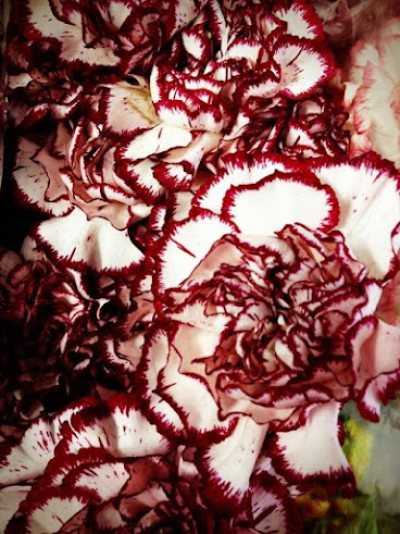
Figure 3.1 Week 3 (05/08/2024) The chosen image.
The petals of the carnation flower have a unique shape, the petals are shaped like a cup, which helps to focus attention on the center of the flower.
Figure 3.2 Week 3 (05/08/2024) The selected part.
I use my phone to identify the letters that I have found, and I extract and take part of the letters from the flowers so it's easier for me to identify the shapes. I use a filter to see the outline petals of the flower more clearly.
1b). Extraction
Figure 3.3 Week 3 (05/08/2024) Dissect & Identify.
After extracting the letters, I traced the shapes using a digital brush pen on my phone before moving on to Adobe Illustrator, so it's easier for me to recreate the shapes as exact as the image. The letters that I got are U, M, B, A, L, and O.
1c). Digitization
Figure 3.4 Week 3 (05/08/2024) Tracing.
I made the cleaner version of the letters with Adobe Illustrator.
1d). Reference Type
Mr. Vinod said we could choose which 10 typefaces we use as a reference, after looking through all the typefaces, I chose Futura Std since I want my letters to be sans serif.
Figure 3.5 Week 3 (05/08/2024)
I chose Futura Std condensed font because my letters look very tall and thin.
Figure 3.6 Week 3 (05/08/2024) Using Futura Std condensed as a ref.
Figure 3.7 Week 3 (05/08/2024) Progress #1
#2 closely resembles the original design, while #3 has a main difference between the letters "M" and "B" where I try to make the letters have the same weight as the referenced typeface.
Below, I tried to use my reference using the ITC New Baskerville Std typeface, but as I thought its shapes and characteristics of the flower petals are gone.
Figure 3.8 Week 3 (05/08/2024) Progress #2
I wanted to see what the letters would look like if I used the Futura Std book font, but I still prefer the condensed font because some lines of my letters are very thin, so it's best if the thin lines are close with the thick lines so it has a balance.
Figure 3.9 Week 3 (05/08/2024) Progress #3
After the feedback from Mr. Vinod, he advised me to cut some of the thin spiky lines because if I placed the letters on the final poster, the spiky lines would distract the wavy weight since the letters presented a flower.
Figure 3.10 Week 3 (05/08/2024) Before vs after final adjustment.
Figure 3.11 Week 3 (05/08/2024) Final.
1.2 Poster Progress
#1
For this task, I really wanted my type of poster to be a horror genre, so I picked the letters to be "LAMB".
Figure 3.12 Week 3 (05/08/2024) Lamb (1) Progress #1.
Figure 3.13 Week 3 (05/08/2024) Textures used in Lamb (1).
Figure 3.14 Week 3 (05/08/2024) Final poster of lamb (1).
#2
Because I'm not satisfied with the first poster because it doesn't mainly focus on the letters, I made another one.
Figure 3.15 Week 3 (05/08/2024) Lamb (2) Progress #1.
I adjusted the size of the letters to be bigger than the first poster so the letters could be the main attraction.
Figure 3.16 Week 3 (05/08/2024) Textures used in Lamb (2).
Figure 3.17 Week 3 (05/08/2024) Final poster of lamb (2).
#3
After the feedback, I realized that I got my task wrong, the poster should be representative of my letters, in my case, a flower.
Because I still want my poster to be in the horror genre, this is what I have come up with.
Figure 3.18 Week 4 (05/15/2024) Flower (1) Progress #1.
Figure 3.19 Week 4 (05/15/2024) Final poster of Umbalo (1).
#4
Ok, after another thought I should lay off the horror idea because it doesn't work as a representative and just accept the fact that my letters are preferable with colorful flowers.
I found a perfect image of a carnation flower as my poster, my idea is to make the letters one of the petals using the gradient tool.
Figure 3.20 Week 4 (05/15/2024) Flower (2) Progress #1.
Figure 3.21 Week 4 (05/15/2024) Final poster of Umbalo (2).
Finally, I'm satisfied with my poster, both the letters and the image resemble and connect with each other.
1.3 Final Outcomes

Figure 3.22 Week 4 (05/15/2024) Extraction.
Figure 3.23 Week 4 (05/15/2024) Final Outcome.
Week 1
- General feedback, For exercise 1, only 3 colors are acceptable and use limited shapes. For this module, we must adjust our time management wisely.
Week 2
- General feedback: For the Random System it's not about just placing random letters. Use blank/negative space wisely.
Week 3
- General Feedback, Refinement process (the process doesn't have to be the same as the original extraction, or from the image you want to add), and extraction (need to be accurate), you need to understand the structure properly of the image, without relying too much on the characteristics you have extracted. It needs to be representative enough. This task focused on lettering. The text must be reflective of the original image (characteristics, personality of the text)
- Specific feedback: the typeface is too condensed, consistent with the weight and characteristics, and the letter for 'b' #2 is preferable.
Week 4
- General feedback Interplay the text with the background, the main and prominent focus: title and visual, the title should represent the image. Integrating the poster is not only placing your text on a still image.
- specific feedback: because the letters I extracted are from a picture of a flower, my poster should represent the flower's characteristics.
Experience
This task mainly teaches me how to manage my time properly. I regretted that I didn't properly dedicate time to the full research and planning That I wanted. I know it helps to ensure that I can deliver high-quality work.
Observation
I learned more about what it means to have consistency in typography elements. What I have concluded is that consistency in typography means maintaining a look and feel throughout a specific design. Clearly establish a full research and follow the guidelines consistently to establish a consistent design.
Findings
For task 2 I noticed that visual theme refers to the consistent use of typography to reinforce or convey a specific concept or idea. The integral of letters and the image can also be used as a visual element to create an atmosphere of the poster.
Figure 4.1 Week 1 (04/22/2024) Typographic Sytems by Kimberly Elam.
This book really helped me to understand and make my own work for Task 1, I used some of the words, and materials from the book on my Task 1 lecture.






.jpg)














.jpg)


Comments
Post a Comment