The uppercase letterforms below suggest symmetry, but in fact, it is not symmetrical. It is easy to see the two different stroke weights of the Baskerville stroke form (below); more noteworthy is the fact that each bracket connecting the serif to the stem has a unique arc.
Figure 1.1 Week 6 (10/31/2023) It looks symmetrical but if look at close inspection it is not symmetrical.
Letters
The uppercase letterforms may also appear symmetrical, but a close examination shows that the width of the left slope is thinner than the right stroke. Both Baskerville (previous) and Univers (below) demonstrate the meticulous care a type designer takes to create letterforms that are both internally harmonious and individually expressive.
Figure 1.2 Week 6 (10/31/2023) uppercase letterforms that appear symmetrical.
The complexity of each individual letterform is neatly demonstrated by examining the lowercase ‘a’ of two seemingly similar sans-serif typefaces Helvetica and Univers. A comparison of how the stems of the letterforms finish and how the bowls meet the stems quickly reveals the palpable difference in character between the two.
Figure 1.4 Week 6 (10/31/2023) Helvetica & Univers in one layout.
Letters / maintaining x-height
The X-height, generally describes the size of the lowercase letterforms. Keep in mind that curved strokes, such as in ‘s’, must rise above the median (or sink below the baseline) in order to appear to be the same size as the vertical and horizontal strokes they adjoin.
Just as important as recognizing specific letterforms is developing a sensitivity to the counter form (or counter)-the space described, and often contained, by the strokes of the form. When letters are joined to form words, the counterform includes the spaces between them.
Figure 1.7 Week 6 (10/31/2023) counter form space.
The latter is a fundamental concept when working with letterforms like lowercase 'r' that have no counters per se. How well you handle the counters when you set type determines how well words hang together other words, how easily we can read what's been set.
The examinations of the form and counter in close detail provide a good feel for how the balance between form and counter is achieved and a palpable sense of the letterform’s unique characteristics. It also gives you a glimpse into the process of letter-making.
Figure 1.8 Week 6 (10/31/2023) examination of the counter form.
Letters / Contrast
The basic principles of Graphic Design apply directly to typography. The following are some examples of contrast most powerful dynamic in design as applied to the type, based on a format devised by Rudi Ruegg. The simple contrasts produce numerous variations:
small+organic/large+machined; small+dark/ large light.
Figure 1.9 Week 6 (10/31/2023) Helvetica contrast to Baskerville.
Figure 1.10 Week 6 (10/31/2023) All various contrast.
Week 7 11.07.2023 Typo_6_Screen&Print
Typography in Different Medium
Typography exists not only on paper but on a multitude of screens. It is subject to many unknown and fluctuating parameters, such as the operating system, system fonts, the device and screen itself, the viewpoint, and more.
1. Type for print, a good typeface for print- Caslon, Garamond, and Baskerville are the most common typefaces that are used for print. Because of their characteristic which are elegant and intellectual but also highly readable when set at small font size. They are versatile, easy-to-digest classic typeface, which has a neutrality and versatility that makes typesetting a breeze.
Figure 2.1 Week 7 (11/07/2023) Type for print.
2. Type for Screen, often modified to enhance readability and performance on-screen in a variety of digital environments. Especially for typefaces intended for smaller sizes is more open spacing. All of these factors serve to improve character recognition and overall readability in the non-print environment, which can include the web, e-books, e-readers, and mobile devices.
Include taller x-height (or reduced ascenders and descenders), wider letterforms, more open counters, heavier thin strokes, and serifs, reduced stroke contrast, as well as modified curves and angles for some designs.
Figure 2.2 Week 7 (11/07/2023) Type for screen.
2a. A hyperactive Link/ hyperlink, is a word/phrase/image that you can click on to jump to a new document or a new section within the current document.
2b. Font size for screen, 16 pxl text on a screen is about the same size as text printed in a book or magazine, if you read at arm's length, you'd want at least 12 pt which is about the same size as 16 pxl on most screens.
2c. System Fonts for Screen / Web Safe Fonts, each device comes with its own pre-installed font selection. Which is based largely on its operating system. The problem is that each differs a little bit. Windows-based devices might have one group. While MacOS ones pull from another.
Then Google’s own Android system uses their own as well. Let’s say the designer picked some obscure, paid font family for this site’s design. If you don’t have that font already installed and it’s not pulling from a web-friendly place, the font you see would default back to some basic variation like Times New Roman. You, as the visitor, wouldn’t necessarily know that’s what happened, though. To you, it would just look plain ugly.
‘Web safe’ ones, however, appear across all operating systems. They’re the small collection of fonts that overlap from Windows to Mac to Google.(Open Sans, Lato, Arial, Helvetica, Times New Roman, Times, Courier New, Courier, Verdana, Georgia, Palatino, Garamond).
2d. Pixel Differential between Devices, the screens used by our PCs, tablets, phones, and TVs are not only different sizes, but the text you see on-screen differs in proportion too, because they have different-sized pixels. 100 pixels on a laptop is very different from 100 pixels on a big 60″ HDTV. Even within a single device class, there will be a lot of variation.
Figure 2.3 Week 7 (11/07/2023) Pixel differential between devices.
3. Static Typography, has minimal characteristics in expressing words. Traditional characteristics such as bold and italic offer only a fraction of the expressive potential of dynamic properties. From billboards to posters, magazines to fliers, we encounter all forms of static typography with wide-ranging purposes.
Whether they are informational, promotional, formal, or aspirational pieces of designs, the level of impression and impact they leave on the audience is closely knitted to their emotional connection with the viewers.
4. Motion Typography, temporal media offer typographers opportunities to “dramatize” type, for letterforms to become “fluid” and “kinetic” (Woolman and Bellantoni, 1999). Film title credits present typographic information over time, often bringing it to life through animation. Motion graphics, particularly the brand identities of film and television production companies, increasingly contain animated type.
Type is often overlaid onto music videos and advertisements, often set in motion following the rhythm of a soundtrack. On-screen typography has developed to become expressive, helping to establish the tone of associated content or express a set of brand values. In title sequences, typography must prepare the audience for the film by evoking a certain mood.
Task 2: Typographic Exploration & Communication (Text Formatting and Expression).
Make an editorial text, using the 10 fonts that are given. The layout and composition are suitable, impactful, memorable, and engaging. There are 3 options for the text we need to layout, choose only one.
1.1 Progress
1a.) Ideation.
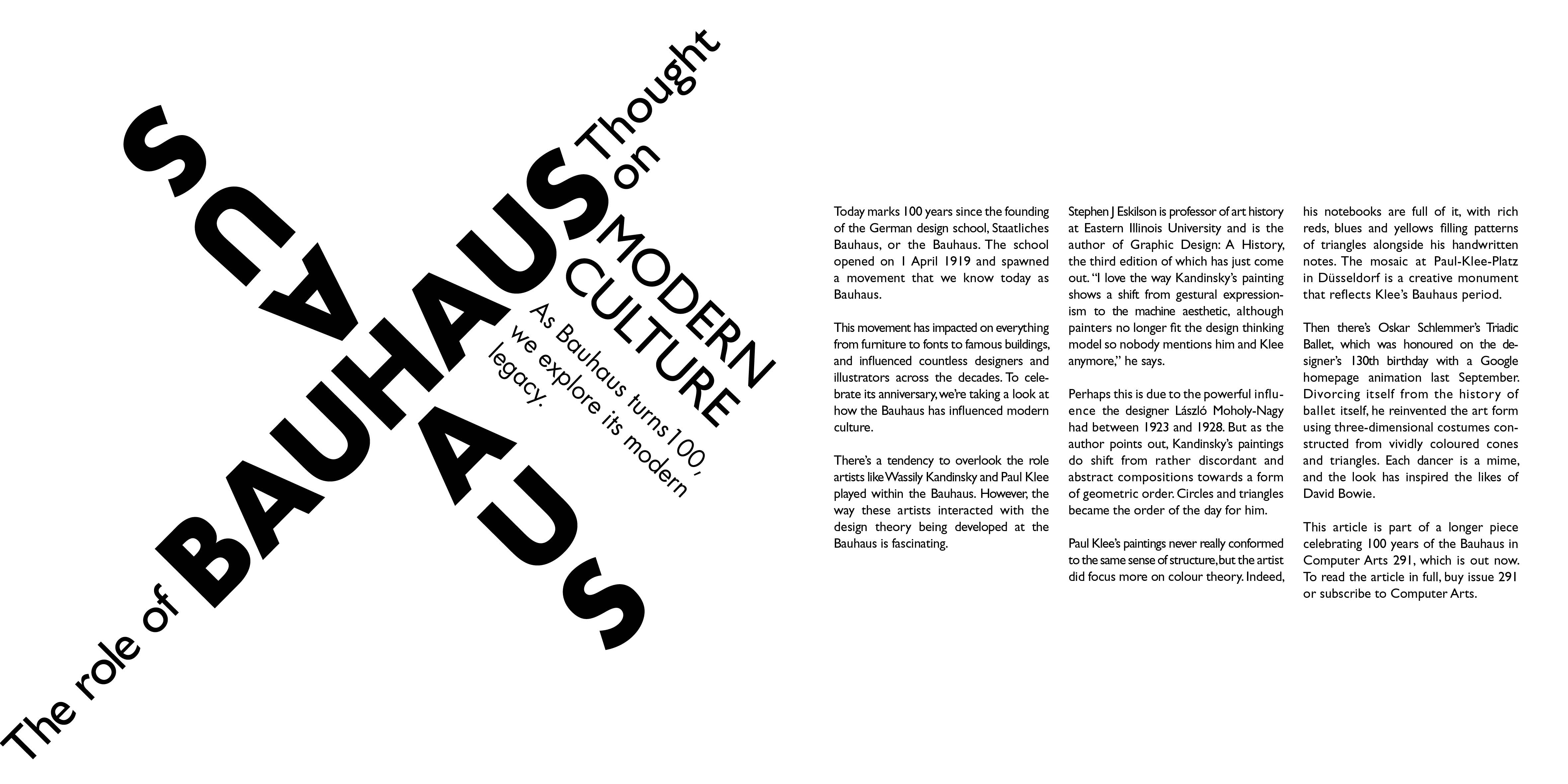
I searched deeper about what 'Bauhaus' is, The Staatliches Bauhaus commonly known as the Bauhaus (German for 'building house'), was a German art school operational from 1919 to 1933 that combined crafts and the fine arts (Wikipedia).
There is this called the Bauhaus movement, which championed a geometric, abstract style featuring little sentiment or emotion and no historical nods, and its aesthetic continues to influence architects, designers, and artists. Key tenets of Bauhaus design include form follows function and "less is more." The style is characterized by a lack of ornament and a focus on clean lines that reduce forms to their essential elements.
What I get from this is that the layout for 'Bauhaus' should emphasize geometric and futuristic elements. With the help of sans-serif typefaces that incorporate straight lines and geometric shapes, it is the perfect futuristic typeface.
Figure 3.2 Week 6 (10/31/2023) Text layout ideas.
Trying to explore different layouts but I haven't tried how will they work out with different typefaces, most of these are different headline layouts, for the body text I'll try to compose them on Indesign. I use PowerPoint for this to quickly see how they will come up.
#1 and #5 are the least appealing to me, while the rest seems fine.
1b.) Digitization.
Figure 3.3 Week 6 (10/31/2023) Using Indesign to create the editorial text.
#1 Attempt is based on the original ideation, and nothing much changed, I made two versions since the first one I thought that the sub-text looked out of place with the headline, so I tried to make another version where the sub-text is crooked just like the headline.
#2 attempt is to make the letter 'h' like a tall building, The 'Futura' typeface helped to make the look more futuristic.
#3 attempt is to create a geometrical design for 'Bauhaus' by repetition of the word "haus".
1.2 Final Result
Figure 3.8 Week 7 (11/07/2023) Without guide baseline (jpg).
Figure 3.9 Week 7 (11/07/2023) Without guide baseline (pdf).
Figure 3.10 Week 7 (11/07/2023) With guide baseline (jpg).
Figure 3.11 Week 7 (11/07/2023) With guide baseline (pdf).
HEAD Font/s: Futura Std Book Type Size/s: 100 pt, 44 pt, 27 pt, 25 pt Leading: 120 pt, 52.8 pt, 32.4 pt, 30 pt Paragraph spacing: 0 mm
BODY
Font/s: Gill Sans Std (Regular) Type Size/s: 9.75 pt Leading: 12 pt Paragraph spacing: 0 mm Characters per line: 40 - 47 Alignment: Justified (Left side)
Margins: 12.7 mm top, 12. 7 mm left + 12.7 mm right + 12.7 mm bottom Columns: 3 Gutter: 5 mm
FEEDBACK
Week 6 10.31.2023
Specific feedback, for #1 it is not recommended to make the sub-text crooked/bent. When using Gill Sans as the typeface make sure to increase the point size since the thinness of its letters, the letters may appear too small.
General feedback,make
a clear statement about what you want to achieve in formatting the headline, The Headline, and sub-text can be on
the same page but make sure that it is formatted not too abstractly from each other, you can use punctuation but more than 3 is enough. Read more books/magazines as a reference and to understand how to layout visually composed.
Week 711.07.2023
Specific feedback, making the letters of the font larger the same as screen-reading can help to increase the overall readability of the font (you can use magazine articles as a reference of the type size).
General feedback, make a clear statement about what you want to
express, headline and sub-text can be on the same page. When using an indent (a first-line indent signals to the reader that a new paragraph is starting), an indent is usually used in the second paragraph (not the first paragraph).
REFLECTION
Experience
I feel I have a different approach to typography at working on my tasks than before. As I started learning more about typography, I became aware of how typefaces can impact the overall visual appearance of a design. The choice of font can drastically change the tone of a design. By understanding the principles of typography and practicing them in my designs, I have learned how to use typography to create an effective design.
Observation
I noticed that simplicity in text formatting is generally preferred because it is more visually pleasing and easier to read, so when typography is simple, the text is easier to understand quickly. Since it allows the text to be more flexible and adaptable. Another thing I learned about typography, is that kerning is also the key element that can greatly impact the overall appearance of a design. Proper kerning can help make the text easier to read and understand. Lastly, the other aspect of typography that I found to be very important is hierarchy. Effective typography involves readers understanding the content.
Findings
One essential aspect of typography is selecting appropriate typefaces. Different typefaces convey different emotions, information, and styles, selecting the appropriate typefaces can make the difference between a bland design and a visually appealing one, this is also impacted by different typography elements (headings, and body text).
FURTHER READING
Figure 4.1 Week 6 (10/31/2023) The Vignelli Canon.
This book covers the key elements of design, such as typography, grids, color, and style, and it provides an in-depth discussion of the idea of simplicity and clearness in design. Vignelli believes that good design should be simple, clear, and elegant, and it should communicate effectively.
To me this book provides an insightful and practical guide to the principles and elements of design, it also gives me a new valuable perspective on the role of making a design and the meaning of a good design itself.
Figure 4.2 Week 6 (10/31/2023) summary of the book.
Figure 4.3 Week 6 (10/31/2023) summary of the book.
Figure 4.4 Week 6 (10/31/2023) summary of the book.
Figure 4.5 Week 6 (10/31/2023) summary of the book.
Figure 4.6 Week 6 (10/31/2023) summary of the book.
Figure 4.7 Week 6 (10/31/2023) summary of the book.
Figure 4.8 Week 6 (10/31/2023) summary of the book.
23.04.2025 - 25.06.2025 week 1 - week 14 Sheryne Axellia Putri / 0367267 / Bachelor of Design (Honours) in Creative Media Creative Brand Strategy Project 4 Quick Links Project 1 Project 2 Project 3 INSTRUCTIONS Project 1 1A: Case Study You are to analyse a well-established Rebranding Campaign of your choosing. 1. Identifying its brand strategy: The Brand Story, Objective & Purpose, Brand Values, Vision & Mission, Target Audience, Brand Positioning. 2. Understanding its brand experience: features and activities. 3. Reviewing its key visuals and the applications: identity and usage from different platforms. 1B: Campaign Proposal You are to propose a Branding Campaign. The campaign will be for a snack of your choosing and may be conceptualised as a rebranding exercise to introduce a new concept or as a new product line launch. ...
24 .04.2025 - 04.07.2025 week 1 - week 11 Sheryne Axellia Putri / 0367267 / Bachelor of Design (Honours) in Creative Media Packaging & Merchandising Design Final Project TABLE OF CONTENTS 1. Instructions 2. Feedback 3. Reflection LECTURES *All lectures are noted in exercise blog. INSTRUCTIONS Final Project Students will build upon the existing packaging design and food product to create a cohesive brand experience through merchandise and promotional initiatives. They will identify opportunities to enhance brand visibility, attract new customers, and foster brand loyalty by designing merchandise items and implementing promotional strategies tailored to the target audience and market context. Students will be required to create FIVE (5) merchandise items, including a POP Display based on Project...
23 .04.2025 - ..2025 week 1 - week 14 Sheryne Axellia Putri / 0367267 / Bachelor of Design (Honours) in Creative Media Publishing Design Exercises TABLE OF CONTENTS 1. Lectures 2. Instructions 1.1 Progress - Writing 2.1 Progress - Illustrations 3.1 Progress - Book 4.1 Progress - Ebook Final Submission 3. Feedback 4. Reflection LECTURES Week 1 23.04.2025_Format There are many forms of publication: books, magazines, and newspapers. Keep in mind that when you design for publication, you have to think of the mass audience. For this semester, we focus on the book format, one of the most important and influential formats. And most important advances in publishing were centered around the book. The Book The book is a medium to document and transmit ideas, knowledge, records, history, and so much ...


Comments
Post a Comment