Typography [Task 1: Exercises]
09.26.2023 - 10.31.2023 / week 1 - week 6
Sheryne Axellia Putri / 0367267 / Bachelor of Design (Honours) in Creative Media
Typography Task 1
TABLE OF CONTENTS
Italic, named for fifteenth-century Italian handwriting on which the forms are based.
Boldface, characterized by a thicker stroke than a Roman form. Depending upon the relative stroke widths within the typeface, it can also be called ‘semibold’, ‘medium’, ‘black’, ‘extra bold’, or super. In some typefaces (notably Bodoni), the boldest rendition of the typeface is referred to as ‘Poster’.
Light, a lighter stroke than the Roman form. Even lighter strokes are called ‘thin’.
Sheryne Axellia Putri / 0367267 / Bachelor of Design (Honours) in Creative Media
Typography Task 1
TABLE OF CONTENTS
1. Lectures
2. Instructions
- Task
3. Feedback
4. Reflection
Task 2→


.jpg)

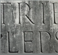

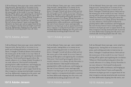
 Figure 1.7 Week 1 (09/26/2023) 4th or 5th century: Square Capitals


1. Cross-alignment: when 2 columns of text are next to each other where the text line is aligned with the next column as well to maintain a good reading rhythm. By ensuring the leading and the paragraph spacing have equal value you ensure cross-alignment.


Widows and Orphans: flush right and ragged left text is somewhat more forgiving towards widows, Orphans remain unpardonable.


Reminder, when you change the color of the body text, you can only use black, cyan, and magenta.


Placing a field of color at the back of the text, and maintaining the left reading axis (right example) of the text ensures readability is at its best.


There are many kinds of subdivisions within the text of chapters. The following visuals have been labeled (A, B, and C) according to the level of importance.


There is no single way to express hierarchy within the text; in fact, the possibilities are virtually limitless.


Lowercase, include the same characters as uppercase.

Uppercase Numeral, also called lining figures, these numerals are the same height as uppercase letters and are all set to the same kerning width. They are most successfully used with tabular material or in any situation that calls for uppercase letters.


Punctuation, miscellaneous characters, although all fonts contain standard punctuation marks, miscellaneous characters can change from typeface to typeface. It’s important to be acquainted with all the characters available in a typeface before you choose the appropriate type for a particular job.
 Roman, the letterform is so called because the uppercase forms are derived from inscriptions of Roman monuments. A slightly lighter stroke in Roman is known as ‘Book'.
LECTURES
Week 1 09.09.2023 Typo_0_Introduction - Typo_1_Development
Throughout the first to the last sessions, the lectures explained the basic rules and what would be conducted in the module, we needed to make a blog as an E-portfolio, so we could share the summary of each class, progress, findings, and final results.
Typography.
As a subject in a module: a fundamental aspect in any design study discipline.
Typography is the creation of typefaces, the act of creating letters or letter shapes. It can come in an animated form, visible in some website and app designs, signs in public spaces, books, posters, and logotypes. Typography has a bearing on the way you present yourself, your information, and how you communicate.

Figure 1.1 Week 1 (09/26/2023)The geometrical shapes have been used to create the letter shapes.
Typography has evolved over 500 years: calligraphy > lettering > typography.
- Calligraphy: the writing style

Figure 1.2 Week 1 (09/26/2023) Black letter calligraphy is characterized by its bold, angular letterforms.
.jpg)
source:http://www.federflug.com/about/styles/
Figure 1.3 Week 1 (09/26/2023) Informal calligraphy, often used in everyday applications, such as letter writing, often uses less formal design elements and is often more personal.
- Lettering: drawing the letters
- Typography: the style and appearance of printed matter. (oxforddictionaries.com)
- The art and techniques of arranging type to make written language legible, readable, and appealing when displayed. The term Typography is also applied to the style, arrangement, and appearance of the letters, numbers, and symbols created by the process. (wikipedia.com)
- Font: A font refers to the individual font or weight within the typeface ( Georgia Regular, Georgia Italic, and Georgia Bold).
- Typeface: A typeface refers to the entire family of fonts or weights that do not share similar characteristics or styles (Georgia, Arial, Times New Roman, Didot, and Futura)
The information presented here came from the book called "Kane J. (2002) A Type Primer."
- The history of Typography from the Western world.
1. Early letterform development: Phoenician to Roman.
Back then, writing meant scratching into wet clay with a sharpened tool with a chisel. Phoenicians, like other Semitic people wrote from right to left. The Greeks changed the direction of writing, developed a style of writing called 'boustrophedon', and changed the lines of text into:

Figure 1.4 Week 1 (09/26/2023)
Etruscan (and then Roman) carvers painted letterforms before inscribing them. Certain qualities of their strokes: a change in weight from vertical to horizontal, a broadening of the stroke at start and finish.

Figure 1.5 Week 1 (09/26/2023) Late 1st-century B.C.E Augustan inscription in the Roman Forum, Rome.
2. Early letterform development

Figure 1.6 Week 1 (09/26/2023)
3. Hand script from 3rd - 10th century C.E.The letterforms have serifs added to the finish of the main strokes.

Compressed version of square capitals.
Took far less time to write. Slightly harder to read due to their compressed nature.

Figure 1.8 Week 1 (09/26/2023)Late 3rd - 4th century: Rustic capitals
Both square and rustic capitals were typically reserved for documents of some intended performance. It is the beginning of what we refer to as lowercase letterforms.

Figure 1.9 Week 1 (09/26/2023)4th century: Roman cursive
Uncials
Incorporated some aspects of the Roman cursive hand (A, D, E, H, M, U, and Q). 'Uncia' is Latin for a twelfth of anything. It might be more accurate to think of uncials simply as small letters. The broad forms of uncials are more readable at small sizes than rustic capitals.

Figure 1.10 Week 1 (09/26/2023)4th - 5th century: Uncials
Half Uncials
Mark the formal beginning of lowercase letterforms, replete with ascenders and descenders, 2000 years after the origin of the Phoenician alphabet.

Figure 1.11 Week 1 (09/26/2023)C. 500: Half - Uncials
Caroline Miniscule
Charlemagne, the first unifier of Europe since the Romans, issued an edict in 789 to standardize all ecclesiastical texts. They realized that too many ways of writing could lead to misinterpretation. The texts were rewritten using both majuscules (uppercase), and minuscule, capitalization and punctuation which set the standard for calligraphy for a century.

Figure 1.12 Week 1 (09/26/2023)C. 925: Caroline minuscule
4. Blackletter to Gutenberg's type
Gutenberg was a German craftsman and inventor, his inventions included the mechanized printing press. There were regional variations upon Alcuin's script after the dissolution of Charlemagne's empire. In northern Europe, a condensed strongly vertical letterform known as 'Blackletter' or 'Textura' gained popularity. In the South, a rounder more open hand is called 'rotunda'. The humanistic script in Italy is based on Alcuin's miniscule.

Figure 1.13 Week 1 (09/26/2023) c. 1300. Blackletter (Textura)

Figure 1.14 Week 1 (09/26/2023) c. 1455: 42 line bible, Jogan Gutenberg, Mainz
Gutenberg's skills included engineering, metalsmithing, and chemistry. He marshaled them all to build pages that accurately mimicked the work of the scribe's hand, his type of mold required a different brass matrix, or negative impression for each letterform.
Text Type classification (devised by Alexander Lawson)

Figure 1.15 Week 1 (09/26/2023)
Week 2 10.03.2023 Typo_3_Text_P1
- Textual formatting
A type that calls attention to itself before the reader can get to the actual words is simply interference and should be avoided. Change the type if you see the type before you see the words.
1. Text / Tracking: Kerning and Letterspacing
- Kerning: refers to the automatic adjustment of space between letters, and the adjustment of the space between individual letterforms. Mostly for headlines.
- Letterspacing: means to add space between the letters. Mostly for uppercase letters.
- Tracking: The addition and removal of space in a word or a sentence. Adjusts spacing uniformly over a range of characters.

Figure 2.1 Week 2 (10/03/2023)
Tracking: kerning + letterspacing, the readability of the text may decrease.

Figure 2.2 Week 2 (10/03/2023)

Figure 2.3 Week 2 (10/03/2023)Counterform is the black spaces
2. Formatting Text
a.) Flush left, this format most closely mirrors the asymmetrical experience of handwriting. Each line starts at the same point but ends wherever the last word on the line ends. Spaces between words are consistent throughout the text, allowing the type to create an even gray value. The most readable format.
gray value: text on a white page as an intensity value.
Ragging: space at the edge of the text block.

Figure 2.4 Week 2 (10/03/2023)
b.) Centered, this format imposes symmetry upon the text, assigning equal value and weight to both ends of any line. It transforms fields of text into shapes, thereby adding a pictorial quality to material that is non-pictorial by nature. Because centered type creates such a strong shape on the page, it's important to amend line breaks so that text does not appear too jagged. It is not advised to use long-formatted text because it's hard to read, it's better to use centered text sparingly.
Figure 2.5 Week 2 (10/03/2023)
c.) Flush right, this format places emphasis on the end of a line as opposed to its start. It can be useful in situations (like captions) where the relationship between text and image might be ambiguous without a strong orientation to the right.
Figure 2.6 Week 2 (10/03/2023)
d.) Justified, like centering, this format imposes a symmetrical shape on the text. It is achieved by expanding or reducing spaces between words and, sometimes, between letters. The resulting openness of lines can occasionally produce 'rivers' of white space running vertically through the text. Careful attention to line breaks and hyphenation is required to amend this problem whenever possible. The gaps due to the justification are overwhelming.

Figure 2.7 Week 2 (10/03/2023)
3. Texture
It is important to understand how different typefaces feel as text. Different typefaces suit different messages. A good typographer has to know which typefaces best suits the message at hand. Consider, too, the different textures of these typefaces. A type with a relatively generous x-height or heavy stroke width produces a darker mass on the page than one with a relatively smaller x-height or lighter stroke. Sensitivity to these differences in color is fundamental for creating successful layouts.

Figure 2.8 Week 2 (10/03/2023) Anatomy of a Typeface

Figure 2.9 Week 2 (10/03/2023)
Baskerville tends to have a slightly larger X-height and is generally readable. This example of typeface is not meant to be read on-screen at this size. The balance amount of gray value is what makes it readable. Contrast refers to the thick and thin of the strokes, if the strokes have too much contrast at the smallest sizes the thinnest strokes disappear, as in the case of "Bodoni."

Figure 2.10 Week 2 (10/03/2023) Typefaces that are readable for screen reading.
4. Leading and Line Length
The goal in setting text type is to allow for easy, prolonged reading. At the same time, a field of type should occupy the page as much as a photograph does.
- Type size: Text type should be large enough to be read easily at arm's length — imagine yourself holding a book in your lap.
- Leading: Text that is set too tightly encourages vertical eye movement; a reader can easily lose his or her place. A type set too loosely creates striped patterns that distract the reader from the material.
- Line length: Appropriate leading for text is as much a function of the line length as it is a question of type size and leading. Shorter lines require less leading; longer lines require more. A good rule of thumb is to keep the line length between 55 and 65 characters. Extremely long or short line lengths impair reading.

Figure 2.11 Week 2 (10/03/2023) A typeface with different leading, 10/12-10/13 most readable.
5. Type Specimen Book.
A type specimen book (or ebook for the screen) shows samples of typefaces in various sizes. It provides an accurate reference for type, type size, type leading, type line length, etc.

Figure 2.12 Week 2 (10/03/2023)
- Compositional requirement: Text should create a field that can occupy a page or a screen. Think of your ideal text as having a middle gray value next and not a series of stripes.

Figure 2.13 Week 2 (10/03/2023)
Generally, the one on the left is more balanced of (+) and (-), readability is subjective, and the one on the right is much lighter.
It is often useful to enlarge the type to 400% on the screen to get a clear sense of the relationship between descenders on one line and ascenders on the line below. Nothing replaces looking closely at an actual printout of your work,

Figure 2.14 Week 2 (10/03/2023)
The difference one point leading can make a difference that is unrecognizable at 100% on most monitors, the one at the bottom is much lighter.
Week 3 10.10.2023 Typo_4_Text_P2
- Text / Indicating Paragraphs

Figure 3.1 Week 3 (10/10/2023) Indicating paragraphs using ¶.
The example here displays a 'line space' (leading) between the paragraphs. Hence if the line space is 12pt, then the paragraph space is 12pt. This ensures cross-alignment across columns of text.

Figure 3.2 Week 3 (10/10/2023) Leading between paragraphs.
If your text pt size is 10pt your leading would be 12pt-12.5pt-13pt (2-3 pt larger). If the leading is 12pt the paragraph space value also should be 12. The purpose is to maintain cross-alignment.
The difference between leading and line space

Figure 3.3 Week 3 (10/10/2023) Leading and line spaces.
2. Standard indentation, typically here the indent is the same size of the line spacing or the same as the point size of your text. Indentation was used to save space in a newspaper to cram all the text into a small column. Whenever using Indentation you shouldn't have ragging on the right, best to use it when the text is justified.

Figure 3.4 Week 3 (10/10/2023) Example of standard indentation.
3. Extended Paragraphs, create unusually wide columns of text. Despite these problems, there can be strong compositional or functional reasons for choosing it (academic writing).

Figure 3.5 Week 3 (10/10/2023) Example of extended paragraphs.
- Text / Widows and Orphans
1. Widow: a short line of type left alone at the end of a column of text
2. Orphan: a short line of type left alone at the start of a new column
⤷ avoid the occurrence of the above-mentioned as much as possible → by reducing the column height on one side and introducing a second line, so you have at least a second line.
Solutions: widows→ Rebreak your line endings throughout your paragraph so that the last line of any paragraph is not noticeably short. You can also avoid it by using kerning and letterspacing but with only 1-3/3-1 spaces.
Solutions: orphans→Make sure that no column of text starts with the last line of the proceeding paragraph.

Figure 3.6 Week 3 (10/10/2023) Identifying widow and orphan in text.
- Text / Highlighting Text
Examples of how to highlight text within a column of text. Different kinds of emphasis require different kinds of contrast.

Figure 3.7 Week 3 (10/10/2023) Example of different techniques to highlight the text (Italic and bold).

Figure 3.8 Week 3 (10/10/2023) Example of different techniques to highlight the text (sans serif and color).
In the example below, if you want to change the type family to highlight the text, (serif typeface for the body text & sans serif typeface for the highlight text). You should reduce the pt size of the highlighted text.

Figure 3.9 Week 3 (10/10/2023) How to use serif typeface as highlights. The sans serif font (Univers) has been reduced by 5 to match the x-height of the serif typeface 8 ≠ 7.5

Figure 3.10 Week 3 (10/10/2023) Reduced aligned figures (numbers) or all capital acronyms embedded in text by 5 pt as well, to ensure visual cohesion of the text.

Figure 3.11 Week 3 (10/10/2023) The use of placing a field color at the back of the text.
Sometimes it is necessary to place certain typographic elements outside the left margin of a column of the type (extending as opposed to indenting) to maintain a strong reading axis. When you're creating a headline it is best the quotation is outside of the column.

Figure 3.12 Week 3 (10/10/2023) The use of Typographic elements in text.
Quotation marks, like bullets, can create a clear indent, breaking the left reading axis. Compare the indented quote at the top with the extended quote at the bottom.


Figure 3.13 Week 3 (10/10/2023) The use and types of quotation marks.
1. A head, indicates a clear break between the topics within a section. In the following examples 'A' heads are set larger than the text, in small caps and in bold. The fourth example shows an A head 'extended' to the left of the text.

Figure 3.14 Week 3 (10/10/2023) The use of A head in paragraphs.
2. B head, here is subordinate to A heads. B heads indicate a new supporting argument or example for the topic at hand. As such they should not interrupt the text as strongly as A heads do. Here the B heads are shown in small caps, italic, bold serif, and bold san serif.

Figure 3.15 Week 3 (10/10/2023) The use of B head in paragraphs.
3. C heads, although not common, highlight specific facets of material within B head text. They do not materially interrupt the flow of reading. C heads are shown in small caps, italics, serif bold, and san serif bold. C heads in this configuration are followed by at least an em space for visual separation.

Figure 3.16 Week 3 (10/10/2023) The use of C head in paragraphs.
- Text / Cross Alignment
Cross-aligning headlines and captions with text type reinforces the architectural sense of the page and the structure while articulating the complimentary vertical rhythms. In this example, four lines of caption type (leaded 9 pts.) cross-align with three lines of text (leaded to 13.5 pts)

Figure 3.17 Week 3 (10/10/2023) Cross aligns.
Below, one line of headline type cross-aligns with two lines of text type, and (right bottom left) four lines of headline type cross-align with five lines of text type.

Figure 3.18 Week 3 (10/10/2023) Headline type cross-aligns.
Week 4 10.17.2023 Typo_2_Basic
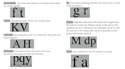
- Basic / Describing letterforms
Knowing a letterform's component parts makes it much easier to identify specific typefaces.
Baseline: The imaginary line is the visual base of the letterforms.
Median: The imaginary line defining the x-height of letterforms.
X-height: The height in any typeface of the lowercase 'x'.

Figure 4.1 Week 4 (10/17/2023) letterform's component part.
Optical Adjustment is important to create balance and consistency in the visual appearance of text, this process is based on the principle that human eyes have regarding the visual appearance of text.


Figure 4.2 & 4.3 Week 4 (10/17/2023).


Figure 4.4 & 4.5 Week 4 (10/17/2023).
- Basic / The font
The full font of a typeface contains much more than 26 letters, numerals, and a few punctuation marks. To work successfully with type, you should make sure that you are working with a full font and you should know how to use it.
Full font: a type family that has many different typefaces.
When you're designing that is very complicated (headline, semi-headline, body text, sub-text) it's best to choose a type family that has a good range of typefaces.
Here are some of the ranges of a type family :
Uppercase / Capital letters, including certain accented vowels, the c cedilla, and n tilde, and the a/e and o/e ligatures.

Figure 4.6 Week 4 (10/17/2023) Uppercase letters.

Figure 4.7 Week 4 (10/17/2023) Lowecase letters.
There are type family letterforms that are designed not to have uppercase/lowercase letters.
Small capitals, uppercase letterforms drawn to the x-height of the typeface. Small Caps are primarily found in serif fonts as part of what is often called an expert set. Most software types include a style command that generates a small cap based on uppercase forms. Do not confuse real small caps with those artificially generated.

Figure 4.8 Week 4 (10/17/2023) Small capitals.

Figure 4.9 Week 4 (10/17/2023) Small capitals with lowercase.
Uppercase Numeral, also called lining figures, these numerals are the same height as uppercase letters and are all set to the same kerning width. They are most successfully used with tabular material or in any situation that calls for uppercase letters.

Figure 4.10 Week 4 (10/17/2023) Uppercase numerals.
Lowercase Numerals, also known as old-style figures or text figures, these numerals are set to x-height with ascenders and descenders. They are best used whenever you would use upper and lowercase letterforms. Lowercase numerals are far less common in sans-serif typefaces than in serif.

Figure 4.11 Week 4 (10/17/2023) Lowercase numerals.
Italic, most fonts today are produced with a matching italic. Small caps, however, are almost always only Roman. The forms in italics refer back to fifteenth-century Italian cursive handwriting. Oblique is typically based on the Roman form of the typeface.

Figure 4.12 Week 4 (10/17/2023) Italic font.

Figure 4.13 Week 4 (10/17/2023) Italic and roman.

Figure 4.14 Week 4 (10/17/2023) Punctuation characters.
Ornaments, are used as flourishes in invitations or certificates. They usually are provided as a font in a larger typeface family. Only a few traditional or classical typefaces contain ornamental fonts as part of the entire typeface family (Adobe Caslon Pro).

Figure 4.15 Week 4 (10/17/2023) Ornaments.
- Basic / Describing Typefaces
Oblique, conversely is based on the Roman form of typeface.
Boldface, characterized by a thicker stroke than a Roman form. Depending upon the relative stroke widths within the typeface, it can also be called ‘semibold’, ‘medium’, ‘black’, ‘extra bold’, or super. In some typefaces (notably Bodoni), the boldest rendition of the typeface is referred to as ‘Poster’.
Light, a lighter stroke than the Roman form. Even lighter strokes are called ‘thin’.
Condense, a version of the Roman form, and extremely condensed styles are often called ‘compressed’.
Extended, an extended variation of a Roman font.


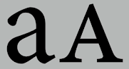
The Rs display a range of attitudes, some whimsical, some stately, some mechanical, others calligraphic some harmonious, and some awkward.
As you study other designers' work, you'll notice that many people who work seriously with type employ a limited palette of typefaces. Some, in fact, go through their entire careers using only one or two.


 1c.) Making the GIF


.gif) Figure 5.11 Week 3 (10/10/2023) #1 attempt of the animation (44 frames).
Figure 5.11 Week 3 (10/10/2023) #1 attempt of the animation (44 frames)..gif)
.gif)
1a.) Research

.jpg)
.jpg) Figure 6.3 Week 4 (10/23/2023) - The 10 typefaces with kerning.
Figure 6.3 Week 4 (10/23/2023) - The 10 typefaces with kerning.

.jpg)


Figure 6.10 & 6.11 Week 4 (10/23/2023) - #5 & 6 attempts at text formatting.


 Figure 8.3 Week 2 (10/03/2023) Summary of Typography, Reference.


Figure 4.16 Week 4 (10/17/2023) various of typefaces.
- Basic / Comparing typefaces
Comparing typefaces What is worth noting isn't the similarities but rather the differences - the accumulation of choices that renders each unique.
Beyond the gross differences in x-height, the forms display a wealth of variety, in line weight, relative stroke widths, and in feeling.

Figure 4.17 Week 4 (10/17/2023) Comparing typefaces.
INSTRUCTIONS
Figure 5.1 Week 1 (09/26/2023) Module Information.
Task 1: Exercises__Type Expression - Text Formatting__
- EXERCISE 1: Type Expression
Choose 4 words to make your own idea of the letterforms using 10 Fonts that are already provided (Bembo Std, STC Garamond Std, Janson Lt Std, Adobe Caslon Pro, ITC New Baskerville Std, Bodoni Std, Serifa Std, Futura Std, Gill sans, Univers Lt Std) to work with the digitization phase and make at least 3 examples of the ideas. No color and heavy distortion may be used in the exercises.
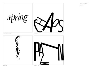
The words I've selected are: "Spring", "Chaos", "Crying", and "Pain."
1.1 Progress
1a.) Sketch Ideas


Figure 5.2 Week 1 (09/26/2023) Rough sketches of the Type Expression.
- I sketched these with my sketchbook and scanned every page, the initial idea was to see how the words may work with some of the 10 fonts and how I could make each one look more appealing. These sketches are straight from my point of view of how the words represent. Most of the words I had chosen are adjectives, it is much harder to compose and express since subjective adjectives reflect one's opinion, and not everyone can relate the same.
1b.) Digitization

Figure 5.3 Week 2, (10/03/2023) The digitization.

Figure 5.4 Week 2 (10/03/2023) The other idea for the digitization.

Figure 5.5 Week 2 (10/03/2023) The progress of digitization.
- The word 'spring' is usually associated with the season, an annual cycle that brings warmth, and growth. This feeling of growth from 'spring' can be expressed through a light and cursive typeface.
- From the sketch to the digitization 'chaos' and 'pain' have the most drastic change, I feel like those two words can be expressed as 'chaotic' since 'chaotic' is an adjective that comes from the noun 'chaos' I tried to put the words together to be messier and lack of order.
- 'Crying' is a universal human emotion easily understood and widely recognized. It can be used to represent the idea of tears flowing, so I use the ear part of the letter "g" from the typeface as if it's a teardrop.
- 'Pain' is the most difficult concept for me to express visually, 'pain' is often associated with physical and emotional suffering, my main idea for 'pain' from the start is that pain will always be there, it is indescribable, top of the pain in will always be another pain, it is layered, the cycle can continue, like a loop. That's why I made two versions of how pain is like a layer.

Figure 5.6 Week 3 (10/10/2023) The final result of the typography that has been approved.
- I adjusted the word 'spring' to give it more like a floral vibe as if the letters are connecting each other with their veins, inspired by this picture.

Figure 5.7 Week 3 (10/10/2023) study of the curly veins of a tree branch.
source: https://pin.it/4pCf19S
- For 'crying' I changed it back to horizontal, and only made the letter "g" like it's dropping, also cut the ear part of "g" as a teardrop to fall down.
- 'Pain' now can be accomplished by looking like it's in a loop and stuck in a cycle by the repetition of the letter "N" similar to how repetitive thoughts can lead to a sense of feeling stuck.
After the artworks had been approved, we were instructed to select one of the works to animate them as a GIF. I chose 'pain' for my type expression animation video. Here is the process:

Figure 5.8 Week 3 (10/10/2023) The making of each frame for the GIF.

Figure 5.9 Week 3 (10/10/2023) There are 44 frames in total.

Figure 5.10 Week 3 (10/10/2023) Animating the Type expression using Photoshop.
.gif)
- I thought if I made each frame with detailed and small movements the animation would go smoother, but what I get instead is slow animation. The movement is too slow and boring, this is not what I was aiming for since I want to create a dizzy effect for the viewer as if they're in a loop.
.gif)
Figure 5.12 Week 3 (10/10/2023) #2 attempt of the animation (19 frames).
I removed some of the frames so the animation could go faster and more dynamic. Thus I achieved what I wanted to express.
1.2 Final Result
Figure 5.13 Week 3 (10/10/2023) - Type Expression.
.gif)
Figure 5.14 Week 3 (10/10/2023) - Type Expression (GIF).
- EXERCISE 2: Text Formatting
We can add pictures that would fit the theme of the text (black & white).
The rules are still the same (no color and heavy distortion), we need to use the only 10 typefaces that are given.
1.1 Progress

Figure 6.1 Week 4 (10/23/2023) - Ideas from Pinterest.
- The #1 reference that I found interesting is that it provides an example of the letterform typeface. For the #2 one what I like is the way the headline is formatted, the #3 reference gives me an idea of how to form the body text.
1b.) Formatting
.jpg)
Figure 6.2 Week 4 (10/23/2023) - The 10 typefaces without kerning.
.jpg)

Figure 6.4 Week 4 (10/23/2023) - The 10 typefaces with different fonts using kerning+tracking.
The instruction was to format the text that was given, here are some of my ideas:
.jpg)
Figure 6.5 Week 4 (10/23/2023) - #1 attempt at text formatting.
- The more I look at it the more out of place it looks, everything about it is so much and overwhelming, and it makes the text less pleasing since there are too many distractions. I suggest removing some of the pictures I have included. Since I've read what the text is about I find it fitting for the whole page in a simple design.


Figure 6.6 & Figure 6.7 Week 4 (10/23/2023) - #2 attempts at text formatting (2 ver.)


Figure 6.8 & 6.9 Week 4 (10/23/2023) - #3 & 4 attempts at text formatting.


- Playing around with the subtext, I find myself having a difficult time adjusting the subtext rather than the headline. My personal favorite would be between #2 and #3, I like how the headline is formatted.
1.2 Final Result
Choose only one final design and require 4 files to be uploaded (2 jpg and 2 pdf files with/without guide baseline.)

Figure 6.12 Week 4 (10/23/2023) Without guide baseline (jpg).
- The approved version of this was based on attempt #3 with small adjustments ( moving the picture to the bottom right adding a description below the picture, and increasing the point size of the headline.
Figure 6.13 Week 4 (10/23/2023) Without guide baseline (pdf).

Figure 6.14 Week 4 (10/23/2023) With guide baseline (jpg).
Figure 6.15 Week 4 (10/23/2023) With guide baseline (pdf).
HEAD
Font/s: Futura Std Book & Heavy
Type Size/s: 72 pt
Leading: 22 pt
Paragraph spacing: 0 mm
Font/s: Futura Std Book & Heavy
Type Size/s: 72 pt
Leading: 22 pt
Paragraph spacing: 0 mm
BODY
Font/s: Futura Std (Book)
Type Size/s: 9 pt
Leading: 11 pt
Paragraph spacing: 0 mm
Characters per line: 69
Alignment: Left alignment
Type Size/s: 9 pt
Leading: 11 pt
Paragraph spacing: 0 mm
Characters per line: 69
Alignment: Left alignment
Margins: 12.7 mm top, 12. 7 mm left + 12.7 mm right + 12.7 mm bottom
Columns: 2
Gutter: 5 mm
Columns: 2
Gutter: 5 mm
FEEDBACK
Week 2 10.03.2023
- Specific Feedback, for my sketches, select at least three ideas that I want to use rather than combining them into one picture, also add descriptions about the general idea. The second design of 'spring' works. I still need to re-do the design for 'chaos', the Baskerville font for 'crying' works + add a teardrop, and the composition for 'pain' needs more work and expression.
- General Feedback, distortion/graphical elements are acceptable if the letter is still there and doesn't become a picture. for example, if we remove the graphical element and the word still stands out (universe) it is fine, it should be simple and supplicate.
Week 3 10.10.2023
- Specific Feedback, the adjustment for spring needs more work and maybe try to push the words together, for 'chaos' is fine, and the idea for 'crying' is good try replacing the drop of the tears with the cut-off "g" and try to fix the replacement of the text.
- General Feedback, label your progress to the format, the portfolio is to show your progress, and you can always come back and update your portfolio. Label the format using "Fig" and add (your thinking process, title, date, and week). Try to finish the reflection every week, the E-portfolio affects your marks.
Week 4 17.10.2023
- Specific Feedback, overall the animation is fine, and try to keep up the further reading. Adjust the type expression final result if you want.
- General Feedback, records the progress while watching the tutorial video, with different options that created, in design is about exploration and phases.
Week 5 24.10.2023
- Specific Feedback, the #3 design is good, and simplicity is very important in this aspect, try to make the "Helvetica" bolder by using the heavy font. Add a small description of the example of the typefaces, and move it between the text so the overall text is in alignment for composition.
- General Feedback, having an alignment is important for composition as it creates an impact on communication. Also, different typefaces can require different type sizes, some typefaces may be more legible at smaller sizes. Below, Futura and Helvetica require smaller type sizes because the typeface is designed for larger sizes.

Figure 7.1 Week 5 (10/24/2023) Typeface's different type sizes.
REFLECTION
Experience
Having an e-portfolio can help me track and showcase my achievements more easily as well as personal reflection, by compiling my learning processes in an e-portfolio, I can track my personal growth over time. Usually, I keep track and make notes of myself by writing in a notebook, an e-portfolio is very easy to access and share so it's convenient for me to bring my digital portfolio. Back when I was still new in this class I was having a hard time figuring out how to show and tell information or expression through Typography, since I'm used to expressing art through brush strokes, through something that doesn't need words. It is truly a first time for me and I'm glad I could learn so much here. In Typography you already have the words, the typeface, and the font that you need, our job is to creatively design those existing words.
Observation
What I found most interesting is that feedback or grades don't tell our creativity, feedback provides information about one's performance and result, it allows one to identify areas for improvement to evaluate, gain insight into one's strengths and weaknesses, and help to build self-awareness. This has helped me to identify areas for improvement and adjust my approach as it is the opportunity to learn from my mistakes. Most importantly feedback helps me to understand how others perceive me and my work, by receiving feedback from others I can gain insight into how my work is being received. I figured that making more options and different sketches for the design rather than one would help me create a better visualization of what I should do and not do.
Findings
My first impression of typography is just a bunch of words being put in the same picture uniquely. After joining the lecture, I learned Typography is more than that, a captivating Typography needs composition, scales, gray value, and the knowledge of typefaces to use both in-screen or paper. The pieces of advice that I keep getting from lectures are to read more about types in books or magazines, see how they are aligned, how the designers created the composition, and learn the history of each typeface and what they were supposed to represent. Now I can see in clearer sight than before what Typography is.
FURTHER READING

Figure 8.1 Week 2 (10/03/2023) Typography, Referenced: A Comprehensive Visual Guide to the Language, History, and Practice of Typography.

Figure 8.2 Week 2 (10/03/2023) Summary of Typography, Reference.


Figure 8.4 Week 3 (10/10/2023) Summary of Typography, Reference.

Figure 8.5 Week 3 (10/10/2023) Summary of Typography, Reference.

Figure 8.6 Week 3 (10/10/2023) Summary of Typography, Reference.

Figure 8.6 Week 3 (10/10/2023) Summary of Typography, Reference.

Figure 8.7 Week 4 (10/17/2023) Just My Type - a book about fonts, by Simon Garfield.

Figure 8.8 Week 4 (10/17/2023) Summary of Just My Type.

Figure 8.9 Week 4 (10/17/2023) Summary of Just My Type.

Figure 8.10 Week 4 (10/17/2023) Summary of Just My Type.


Comments
Post a Comment