Interactive Design [Project 2 : Working Webpage]
04.06.2024 - 02.07.2024 / week 7 - week 11
Sheryne Axellia Putri / 0367267 / Bachelor of Design (Honours) in Creative MediaInteractive Design
Project 2
TABLE OF CONTENTS
1. Lectures
2. Instructions
3. Reflection
LECTURES
Week 7 04.06.2024_CSS Selector
CSS selectors → are a fundamental part of CSS that allows you to target and style HTML elements on a web page.
- Selectors are used to define which elements should receive specific styles, such as colors, fonts, spacing, and more.
- They are a crucial part of web development because they enable you to control the presentation and layout of your web pages.

Figure 1.1 Week 7 (06/04/2024) CSS selectors #1.

Figure 1.2 Week 7 (06/04/2024) CSS selectors #2.

Figure 1.3 Week 7 (06/04/2024) CSS selectors #3.
CSS provides a variety of selectors to offer flexibility and granularity when targeting HTML elements for styling. key reasons why there are so many selectors in CSS:
- Specificity → Different situations may require different levels of specificity when selecting elements.
- Structure → Web pages often have complex structures with nested elements.
- Attribute-Based Selection →You may want to style elements based on their attributes or attribute values.
- Pseudo-Classes and Pseudo-Elements → These selectors help you style elements based on their state or position within the document.
- Responsive Design → Media queries, a type of selector, enable you to apply different styles to elements based on the user's device characteristics, such as screen size, orientation, or resolution.
- Stateful Interactions → Selectors like focus, active, and, checked to allow you to style elements based on user interactions.
- Cross-Browser Compatibility → Different web browsers may interpret and apply CSS rules differently.
- Ease of Maintenance → Depending on the structure and requirements of a web page, certain selectors may make CSS easier to maintain.
- Accessibility → Properly structured and labeled HTML elements can be targeted and styled using CSS selectors to improve accessibility by providing styles that enhance readability and usability for individuals with disabilities.
Week 9 18.06.2024_Box Model
The Display Property
Display → is CSS's most important property for controlling layout.
Every element has a default display value depending on what type of element it is. The default for most elements is usually block or inline.
- Block-level element
<div> is the standard block-level element. A block-level element starts on a new line and stretches out to the left and right as far as it can.

Figure 1.4 Week 9 (06/18/2024) Block-level element.
- Inline Element
<span> is the standard inline element. An inline element can wrap some text inside a paragraph <span> like this </span> without disrupting the flow of that paragraph.

Figure 1.5 Week 9 (06/18/2024) Inline element.
Other Display Properties
- Inline-block
- Flex
- Grid
Box Model in CSS
Most HTML elements are containers. Consider some of the HTML elements we've used so far: body, p, h1, h2, div, ul, ol, li.
- Each of these is a container or box.
- Each box has three layers that surround its content. The layers
are, in order from inside to outside:
- Padding
- Border
- Margin

Figure 1.6 Week 9 (06/18/2024) Box model.
The size of each of the layers in-the-box model can be specified using the usual CSS units of measure (em, %, and px).
- For example, consider the following <p>, which is wrapped inside a <div>:

Figure 1.7 Week 9 (06/18/2024) Box model size.
We can apply the following CSS to the paragraph tag in order to control the size of the padding, border, and margin of the paragraph:

Figure 1.8 Week 9 (06/18/2024) Box model size CSS.
The reason to include an element in the ‘div’ tag/element is to create a layout. Another method to create the layout in CSS is using the position property.
- CSS Flexbox → is a powerful tool for creating responsive and efficient web layouts. It relies on a solid understanding of the Box Model, as they manipulate elements' positioning and spacing within a container.
*Flexbox (Flexible Box Layout)
*Key Concepts:
- Flex Container: The parent element with display: flex.
- Flex Items: The children of the flex container.
*Flex Container:
- Display: flex: Establishes a flex container.
- Flex-direction: Defines the direction of the flex items (row, column).
- Justify-content: Aligns flex items along the main axis (start, end, center, space-between, space-around).
- Align-items: Aligns flex items along the cross-axis (stretch, center, start, and end).
INSTRUCTIONS
Figure 2.1 Week 7 (06/04/2024) Module Information Booklet.

Figure 2.2 Week 11 (07/02/2024) Dreamweaver progress.

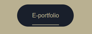
Figure 2.4 Week 11 (07/02/2024) Button link to my e-portfolio.

Figure 2.5 Week 11 (07/02/2024) Dreamweaver progress.

Figure 2.6 Week 11 (07/02/2024) Dreamweaver progress.
1.1 Final Outcome
CV Link: https://sherynecv.netlify.app/
REFLECTION
I was feeling very unwell and couldn't manage my time properly while making this, so the result was not great. I hope my final project will compensate for the shortcomings of project 2.


Comments
Post a Comment