Interactive Design [Exercises]
23.04.2024 - ..2024 / week 1 - week 8
Sheryne Axellia Putri / 0367267 / Bachelor of Design (Honours) in Creative MediaInteractive Design
TABLE OF CONTENTS
Week 1 23.04.2024
- F2F Class:
- Download Adobe Dreamweaver.
- Sign in to Netlify.
- Netlify → Right-click, inspect and choose the device you want to view.
- Call To Action button → CTC (a button that is more different than the rest)
- Primary CTC, and secondary CTC (which one is more primary
than the rest)
- Clickable texts: some texts come in different colors → to inform the user which texts the user can click through using various colors of the text.
-Websites stop using long lengths of websites so the viewer does not scroll.
- White space for a site is important.
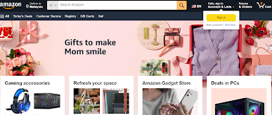
ex: Amazon (the ctc is sign an option)
- Terms and conditions: sign in for an account ex: amazon and Shopee (they have similar layouts → important buttons and the search bar is at the top) whatever is important is always placed on the top.
Key Principle of Usability
Consistency
Simplicity
Visibility
Feedback
Error Prevention
1. Consistency
Consistency is a key factor in web design for visual elements and functionality. Consistency ensures that your website looks coherent and works harmoniously across all its components, such as headers, footers, sidebars, and navigation bars.
Consistent design is intuitive design.
It includes a consistent navigation system, page layout and menu structure, fonts and typography, and branding in web design. Consistency is key for users to recognize and learn these patterns. If similar-looking things do not produce a similar output, the user is bound to become frustrated.
For example, if a website’s buttons are protruding boxes with labels, all of its buttons should look like that. Similarly, if a backward arrow denotes the back button, then it should not be changed to something else because that would be inconsistent with what the user has learned.
2. Simplicity
The principle is that user interfaces should be “simple” for users.
Simplicity is used loosely to refer to the need to minimize the number of steps involved in a process, to use symbols and terminology that make the interface as obvious as possible, and to make it difficult to make mistakes. Incorporating simplicity in a design will help design better user interfaces by helping the users achieve their goals faster and more efficiently, all while enjoying a great user experience.
3. Visibility
Visibility is the basic principle that the more visible an element is, the more likely users will know about it and how to use it. Equally important is the opposite: when something is out of sight, it’s difficult to know about and use. Users should know, just by looking at an interface, what their options are and how to access them.
4. Feedback
Feedback communicates the results of any interaction, making it both visible and understandable. Its job is to give the user a signal that they (or the product) have succeeded or failed at performing a task. An example of feedback is when you’re on desktops or laptops when you hover over navigation items, you expect them to change color or load a submenu.
5. Error Prevention
It involves alerting a user when they’re making an error, to make it easy for them to do whatever it is they are doing without making a mistake. The main reason this principle of error prevention is important is that we humans are prone to and will always make mistakes.
Common Usability Pitfalls and How to Avoid Them
Complex interfaces
Confusing navigation
Poor feedback
Inadequate error handling
- Header → is the top section of a webpage. It usually contains the website's logo, navigation menu, and contact information. The header provides users with quick access to essential information and navigation.
- Body → is the main content area of a webpage. It contains text, images, videos, and other multimedia elements. Proper organization of content within the body is crucial for readability.
- Footer → is located at the bottom of a webpage. It typically includes copyright information, links to important pages, and contact details. The footer provides closure to the webpage and additional navigation options.
- Organizing Content → is key to a well-structured website. Use headings (H1, H2, H3, etc.) to create a hierarchical structure. Logical grouping of content and clear labeling of sections improve user experience.
- Navigation Menus → help users move around the website. Use clear and concise labels for menu items. Consider using dropdown menus for complex sites.
Write a brief report summarizing your findings and recommendations.
What To Have in The Analysis:
Consider the purpose and goals of the website, and evaluate whether they are effectively communicated to the user. Evaluate the visual design and layout of the website, including its use of color, typography, and imagery. Consider the functionality and usability of the website, including its navigation, forms, and interactive elements. Evaluate the quality and relevance of the website's content, including its accuracy, clarity, and organization. Consider the website's performance, including its load times, responsiveness, and compatibility with different devices and browsers.
- Web Analysis (Presentation)
- The image that you will be using does not have to be an exact image from the original website.
- You may replace it with a similar image.
- Focus on the layout, type style, and color style.
- To find similar typefaces/fonts, you can download fonts from Google Fonts.
- You may need to screengrab the website and can begin to replicate the page.
- 1.1 Progress
- 1.2 Outcomes (side by side)
- Create an HTML file named "index.html."
- Create a section that displays the following information:
- Include necessary images for the page
- List of ingredients
- Step-by-step cooking instructions
- Create an external CSS file named "style.css."
- Apply CSS rules to style your recipe card.
- Use CSS selectors such as element selectors (e.g., body, h1, ul), class selectors (e.g., .recipe-title, .ingredient-list), and ID selectors (e.g., #instructions) to style different parts of the card.
- Recipe card link: https://sherynerecipe.netlify.app/
- Final Outcome: https://sherynefirsthtml.netlify.app/


Comments
Post a Comment