Illustration & Visual Narrative [Task 2 : Decisive Moment]
11.01.2023 - 11.22.2023 / week 7 - week 9
Sheryne Axellia Putri / 0367267 / Bachelor of Design (Honours) in Creative MediaIllustration and Visual Narrative
Task 2
LECTURES
Week 6
11.01.2023
The rule of thirds is a popular method of dividing up a design or photo into thirds by
creating a grid that is three columns wide and three rows tall, breaking
a canvas up into evenly-spaced rows and columns can help with common
issues like aligning text, positioning photos, and generally arranging
all the elements in a way that helps guide the viewer’s eye to ingest
the information more easily (like reading a book).
When the rule of thirds is used in the design, the lines meet at four
“intersections” at the center of the page, which fall upon the primary
focus points of the scene. The human eye naturally lands on these points
more readily than other spots in the composition, and the resulting
asymmetry (using the odd number 3, rather than 4 rows and columns)
creates just enough tension to bring a dynamic sense of flow to the
work.

Figure 1.1 Week 6 (11/01/2023) Rule of thirds.
The rule of thirds in graphic design divides a canvas into three
even rows and three even columns. The four central intersections
where the lines meet are the key “hot spots” where you should aim to
place your main subjects, as those are where people’s attention
immediately lands.
The most challenging part of composition is how to arrange the
elements in your visual effectively – and the answer is to arrange
them in a way that brings out meaning. Your composed shots
should consciously arrange the focus of the scene to stand out, even in the subtlest manner.

Figure 1.2 Week 6 (11/01/2023) The Grand Budapest Hotel
(Wes Andersen, 2014).
- Basic Compositional Values.
Composition 1 Visual Narrative, your composition should complement your subject focus and reflect the narrative. Think of the look and feel of the scene. Get their emotions on the
same page.
Visual Flow, your
composition also determines the path of a viewer’s eye through the
visual.
Visual Balance, even
though you can’t know the exact path a viewer’s eye is going to take,
you can nudge things one way or another.

Figure 1.3 Week 6 (11/01/2023) Parasite (Boong Joon Ho, 2019).
Visual Hierarchy, is the way you visualize and focus your subject matters can
have huge effects on the composition the artists make and sometimes
can even affect the course of history.

Figure 1.4 Week 6 (11/01/2023) Christina of Denmark & Anne of Cleeves (Hans Holbein The
Younger,(1538, 1539).

Figure 1.5 Week 6 (11/01/2023) Different types of shots.
- Composition Theory: Fore, mid, and background
Intro
When composing a scene, creating an effective sense of the space is very
important. Together with the other theories, illustrating elements of:
- foreground (close to the viewer).
- Middle-ground.
- Background (far away).

Figure 1.6 Week 7 (11/08/2023) Composition theory #1.

Figure 1.7 Week 7 (11/08/2023) Composition theory #2.
- You can arrange the subject matter to be in the foreground, ex by using size differences and color contrast to highlight the foreground as the main focus.
- Arrange the focus to be in the middle-ground, by using size differences and light/shadow contrast to highlight the main focus.
- The further view of the visual in the background, by using shapes and light/shadow contrast to highlight the main focus.

Figure 1.8 Week 7 (11/08/2023) Composition theory #3.
Design Flow
Good arrangement of visual focus using foreground, middle-ground, and
background should also indicate a sense of movement, and rhythm in a design.
This is known to be Design Flow→is the way your eye moves or is led
around a composition. A design with good flow will lead the viewer's eye
throughout the layout.

Figure 1.9 Week 7 (11/08/2023) Composition theory #4.
This is especially important in interface and information design types where
you need to combine type, line, contrast, color, and imageries.

Figure 1.10 Week 7 (11/08/2023) Composition theory in design
types.
A short study of how to arrange the use of foreground, middle-ground, and
background and combine the sense of flow in the animation.
Figure 1.11 Week 7 (11/08/2023) Composition theory in an animation.
TUTORIAL
Figure 2.1 Week 7 (11/08/2023) Tutorial on how to add texture in
Adobe Illustration.
Figure 2.2 Week 7 (11/08/2023) Tutorial on how to use the Pencil
tool.
Figure 2.3 Week 7 (11/08/2023) Tutorial on how to customize a font
in Adobe Illustration.
PRACTICAL
1. Exercise
After being given the lecture and tutorial using Adobe
Illustration, we were instructed to practice using texture and noise
in Adobe Illustration.
To create textures by adding shading to your illustrations by using
the Grain Effect combined with linear, radial, and freeform
gradients.
These are the given Illustrations that we can use to practice using
textures and gradients in Ai.
1.1 Exercise

Figure 2.4 Week 7 (11/08/2023) #1 illustration.
1.2 Exercise


Figure 2.6 Week 7 (11/08/2023) Progress for #1
illustration.

Figure 2.7 Week 7 (11/08/2023) Progress for #2
illustration.

Figure 2.8 Week 7 (11/08/2023) The final outcomes.
2. Exercise
The pencil tool in Illustrator allows you to draw freeform
paths. It draws paths and places anchor points as you draw.
2.1 Exercise

Figure 2.9 Week 7 (11/08/2023) #1 Pencil exercise.

Figure 2.10 Week 7 (11/08/2023) Final outcome of #1 Pencil
exercise.
2.2 Exercise

Figure 2.11 Week 7 (11/08/2023) #2 Pencil exercise.

Figure 2.13 Week 7 (11/08/2023) Progress for #2 Pencil exercise.

Figure 2.14 Week 7 (11/08/2023) Final outcome of #2 Pencil
exercise.
INSTRUCTIONS
Figure 3.1 Week 6 (11/01/2023) Module Information.
Week 7 11.01.2023 - Editorial Illustration_Decisive moment
Editorial illustrations are produced for newspapers, magazines, and websites to add a visual
dimension to a piece of writing. This serves two main functions – it helps to grab the attention of
the reader as they browse the publication, but can also help to add a
new perspective to the article.
For this assignment, you must find a related article/story that discusses Urban Legends. The legends may be local or international. The art style must be derived from Art Deco.
For this assignment, you must find a related article/story that discusses Urban Legends. The legends may be local or international. The art style must be derived from Art Deco.
In this assignment, you will create a minimalist editorial illustration based on an urban legend of your choice using Adobe Illustrator. Your illustration will be designed for a digital media publication and should include minor animations to enhance engagement.
- Choose an urban legend that interests you and aligns with the editorial theme.
- Research the chosen legend thoroughly and gather visual references.
- Create a concept mood board to explore the style, color scheme, and overall visual direction.
- Write a brief description of your chosen urban legend and how you plan to interpret it in a minimalist style.
- Begin sketching your editorial illustration. Focus on creating a clear and compelling composition.
- Develop your illustration in Adobe Illustrator. Pay attention to clean lines, simple shapes, and minimalism.
- Experiment with the use of color and typography, keeping the editorial context in mind.
- Start planning the minor animations you intend to incorporate.
- Refine your illustration, paying close attention to details, balance, and visual impact.
- Add animations to your design using Adobe Illustrator or other animation software.
- Test the animations to ensure they enhance the overall narrative without being distracting.
- Write a short artist statement explaining your design choices, including how your illustration reflects the chosen urban legend and the editorial context.
- Submit your completed editorial illustration as a high-resolution digital file (preferably vector format).
- Include a link to a presentation or video demonstrating the animations.
- Submit your artist statement and any process documentation.
1.1 Progress
1a.) Research and Ideation
- Art Deco, is a popular design style of the 1920s and ’30s characterized especially by sleek geometric or stylized forms and by the use of man-made materials.
- The characteristic features of Art Deco reflect admiration for the modernity of the machine and for the inherent design qualities of machine-made objects (eg. relative simplicity, planarity, symmetry, and unvaried repetition of elements. Art Deco objects often showcase simple, clean shapes, usually with a “streamlined” look.
- Among the formative influences on Art Deco were Art Nouveau, the Bauhaus, Cubism, and Serge Diaghilev’s Ballets Russes. Practitioners of Art Deco also found inspiration in American Indian, Egyptian, and early Classical sources as well as from nature. (britannica.com)
Rationale
I chose the urban legend 'Sundel Bolong' from Indonesia as my editorial
Illustration.
The Story of Sundel Bolong:
- Similar to the Pontianak, Sundel Bolong is a female ghost with a pale face, long black hair, and a long white dress. Her only distinguishing feature is a large opening in her back that allows a clear view of her internal organs.
- This is because Sundel Bolong gave birth to a baby while she was being abused and died. As a result, she will appear as a stunning woman roaming by herself at night on the road and will conceal the hole in her back to hide her true identity.
- She typically preys not only on men but also on pregnant women and takes newborns. She attracts men, and when they get close, she exposes her organs to them through a bloody hole in her back. This is sufficient to cause the men to pass out. The Sundel Bolong consumes the men's organs when they go unconscious. She takes children, especially newborns, to replace the child she lost.
1b.) Moodboards / concept sketches

Figure 3.2 Week 6 (11/01/2023) Moodboard/character sheet of
the Sundel Bolong.
There are many versions of how the Sundel Bolong looks like, most commonly
is a long-haired woman wearing a long white dress, I made the bottom of
her dress covered in dirt/blood (also on her sleeves). Her skin tone is
different than any human being, noting that she is a ghost/walking corpse.

Figure 3.3 Week 6 (11/01/2023) a look at Sundel Bolong from
the 2007 movie.
My main inspiration for this task is from the movie poster "Legenda
Sundel Bolong" from 2007. I love the color of the film with gray + dark
cyan as the main theme, so I decided to put the color theme in my
illustration.
I watched the movie a long time ago, I love how the movie shows her
character, as tragic, and vengeful. Notice how her skin color matches with
her environment, meaning she is not from our world anymore.

Figure 3.4 Week 6 (11/01/2023) Concept sketch.
I have two sketches that I have in mind, but #1 is not shocking enough
for the reveal of the 'turning point', the sketch made it look like the
young man was the main view. The framing for the two sketches is the
same, I used diagonal composition.
After thinking about what would make the scene more shocking, I tried
switching the place of the characters, with Sundel Bolong as the main
view, and thus I found what I wanted to achieve.

Figure 3.5 Week 6 (11/01/2023) Finalization of the sketch.
I cleaned the sketch so it's easier for me to trace it on Adobe
Illustrator, I also made a version of how well the lighting works.

Figure 3.6 Week 7 (11/08/2023) Tracing the sketch using the Pen
tool.

Figure 3.7 Week 7 (11/08/2023) Basecolor of the
illustration.
1c.) Secondary Animation
Secondary action adds to and enriches the main action and adds more
dimension to the character animation, supplementing or reinforcing the
main action.

|
|
Figure 3.8 Week 7 (11/08/2023) The making of each frame in
Adobe Illustrator.
|

|
| Figure 3.9 Week 7 (11/08/2023) Animating the frames using Photoshop ( There are 47 frames in total). |
|
| Figure 3.20 Week 7 (11/08/2023) Animation #1 attempt. |
I didn't add the whole frames to the animation because I wanted to check if I could make the animation with a few frames instead (30 frames) although the loop looks perfectly fine, but the movement looks unnatural.
After receiving feedback from Mr. Hafiz, he said the shadows of Sundel bolong's back should be affected when the flashlight beam hits her so her silhouette could be a bit darker, and when the flashlight makes contact you can see the details or she could have zero opacity until the flashlight hits her. I chose the last one is my revision, and thus the final result:

Figure 3.11 Week 7 (11/08/2023) Animation #2 attempt.
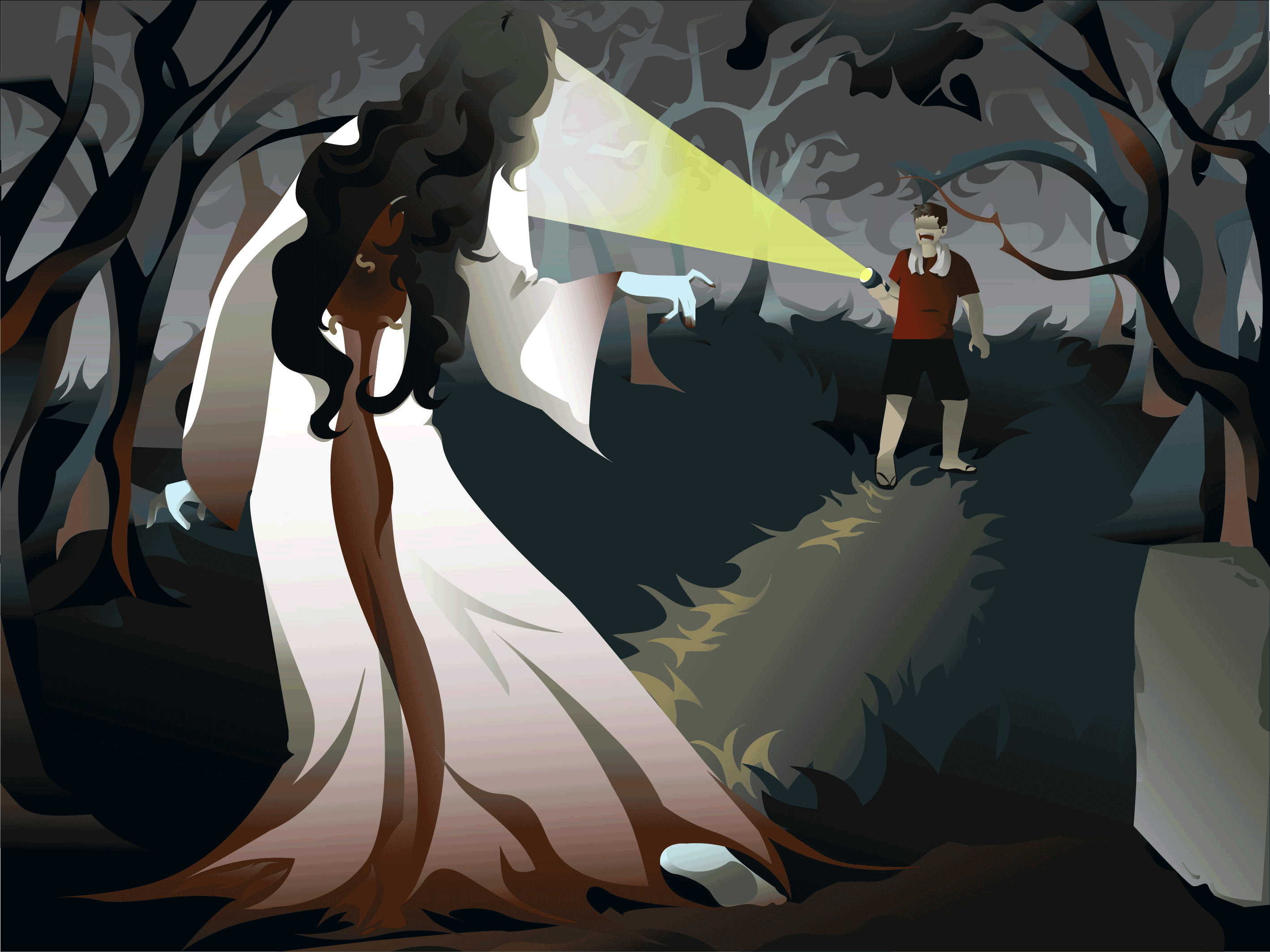
1.2 Final Result

Figure 3.12 Week 9 (11/22/2023) The final illustration (PNG).
Figure 3.13 Week 9 (11/22/2023) The final illustration (pdf).

Figure 3.14 Week 9 (11/22/2023) Animation final outcome.
2.1 Artist Statement
As a student who is currently studying Bachelor of Design in Creative Media,
I need to indulge my creative thinking and ideas in illustrations in any
kind of form. For this assignment, I have chosen to illustrate a decisive
moment from the urban legend that is well known in my country, 'The Sundel
Bolong'. A haunting urban legend that I have been familiar with and heard of
since I was a kid.
- The Sundel Bolong.
From Indonesian mythology, Sundel Bolong is a female ghost that has a wide
gaping hole in the middle of her back, sometimes the hole is hidden from her
long hair. There are a lot of different stories about this ghost, but mostly
the narratives revolve around a tragic backstory.
- Aim
In my illustration, I aimed to capture the elements of Sundel Bolong by
balancing the eerie and Femme Fatale essence, since Sundel Bolong
has become a symbol of the duality of beauty and darkness that exists in our world.
- Narrative
The way the illustration is framed, the main focus is Sundel Bolong
herself, with the wide hole in the middle of her back facing the viewer.
Her body language is delicate, if you look at her feet, shows another
story that she has probably just got out from the grave.
The flashlight lights her face directly, yet we don't know what her face
looks like, with the guy's expression we can clearly see that he is scared
and shocked at the Sundel Bolong in front of him. My choice of colors mainly dominated dark cyan and grayish tones. Enhances
the mystery and scary environment.
FEEDBACK
Week 7 11.01.2023
It is important to have a clear goal of what you want to achieve in your
illustration, which is why doing research and making a mood board for your
ideas helps to collect your thoughts. After showing my temporary result to
Mr. Hafiz, he said the composition looked good but needed more color and an
Art Deco style.

Figure 4.1 Week 7 (11/08/2023) Before and after the feedback.
So I added more shapes and colors for the trees and added more details in
some parts to achieve the Art Deco style.
REFLECTION
Experience
From the previous task, I know now what I should do/shouldn't do. For
example, I know now that in making a full illustration I need to separate my
layers and name them as what their function is. This also helped me to track
my progress and find each object.

Figure 4.2 Week 7 (11/08/2023) Separate layers.
Observation
Findings
Lighting can greatly affect the mood, atmosphere, and overall impact of an
illustration. It can also help to create tension by highlighting or
shadowing certain elements. Shadows can give a sense of volume and weight to
the subject/object to create directionality.
FURTHER READING

Figure 5.1 Week 8 (11/15/2023) Framed ink by Marcos Mateu-Mestre.
Mr. Hafiz shared this PDF version of this book in our lectures, so I
thought of giving it a quick read. The book explores the artistic and metaphors of framing that are used to
convey emotion and meaning.

Figure 5.2 Week 8 (11/15/2023) Summary of framed ink #1.

Figure 5.3 Week 8 (11/15/2023) Summary of framed ink #2.
Comments
Post a Comment